


Introduction
Ei Mindspark App - Naandi is an educational platform designed to personalize learning for students through adaptive learning techniques. The usability audit aimed to identify pain points in the user interface and provide design recommendations based on UX principles to enhance usability, accessibility, and overall user experience.
Objective
The primary objective of the usability testing was to evaluate the app’s usability issues and recommend solutions based on UX best practices to enhance user interaction, engagement, and learning efficiency.
Identified Issues & UX Recommendations
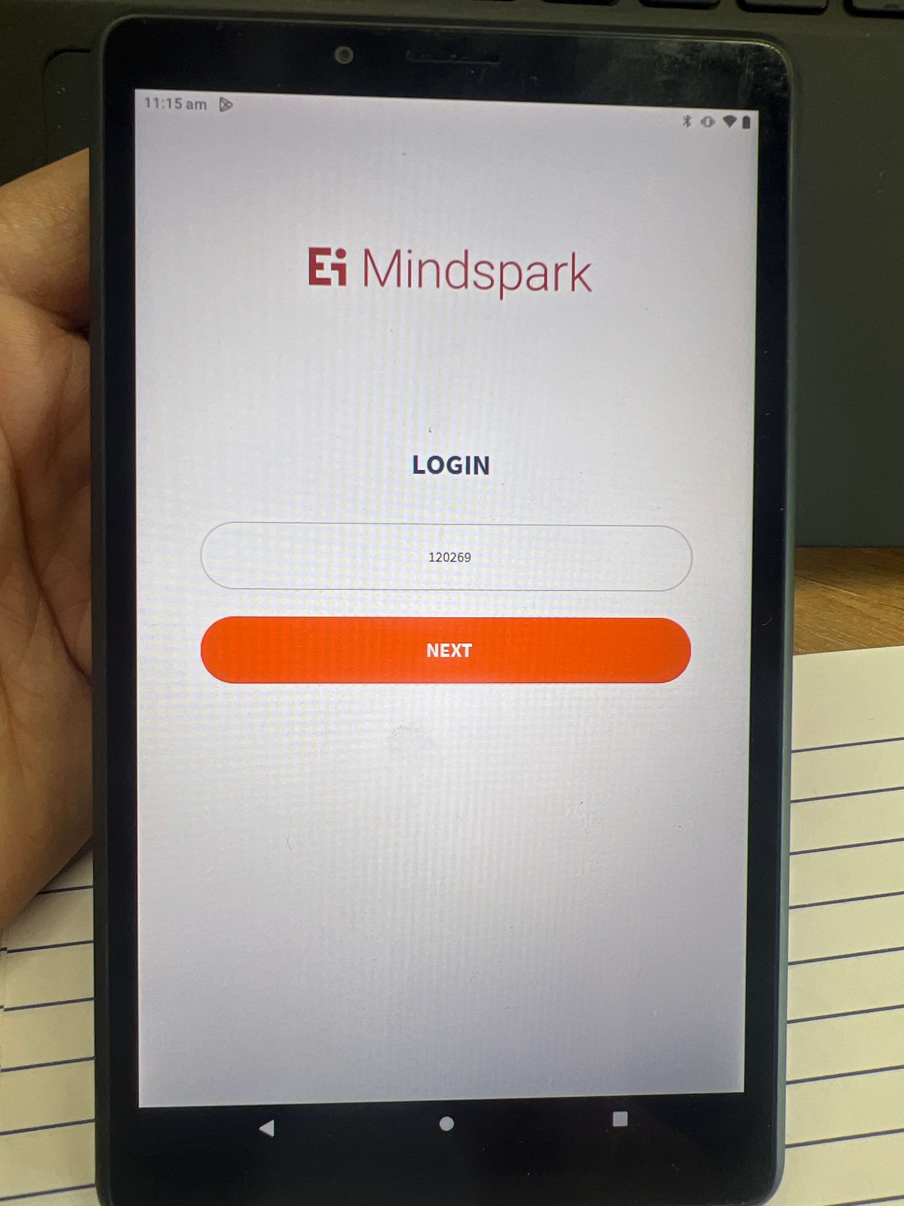
1. Login Screen - Cursor Positioning
Introduction
The login screen is one of the most crucial touchpoints in a digital product's user journey. A well-designed login interface ensures a smooth user experience, minimizing errors and frustrations. During the usability testing of the login screen, a key issue was identified regarding the font size of input text. This study analyzes the usability problem, discusses its impact on the user experience, and provides actionable solutions based on UX principles.
Problem: Text Size in Input Fields is Too Small
Why is This a Problem?
- Readability and Legibility (UX Principle: Visibility & Readability)
- Small text can strain the user's eyes, making it difficult to read the input clearly, especially on mobile devices.
- Small text can strain the user's eyes, making it difficult to read the input clearly, especially on mobile devices.
- Error Prevention (UX Principle: Error Prevention & User Control)
- Small text increases the likelihood of misreading or mistyping input, leading to login failures and frustration.
- Users may need to re-enter their credentials multiple times, causing potential abandonment.
- Visual Hierarchy & Aesthetic Usability (UX Principle: Visual Hierarchy)
- A login screen should have a clear focus on key elements. Small text in input fields diminishes their prominence, making them harder to locate quickly.
- Maintaining a proper visual hierarchy ensures a seamless flow of interaction, making it intuitive for users to engage.
Recommendations for Improvement
- Increase Font Size to 16px (Minimum Standard)
- A minimum font size of 16px is recommended for input text to ensure readability and prevent users from zooming in manually.
- This aligns with web accessibility standards, improving usability for all users.
- Maintain Proper Contrast (UX Principle: Contrast & Accessibility)
- Ensure that input text contrasts sufficiently with the background.
- Example: Using a dark gray (#333333) text on a white (#FFFFFF) background improves legibility.
- Visual Hierarchy & Aesthetic Usability (UX Principle: Visual Hierarchy)
- Adequate spacing around input fields improves usability.
- Example: Adding 10-12px padding inside input fields enhances the interactive area, making the input field visually distinct.
- Implement Placeholder Text and Labels Clearly
- Ensure that input text contrasts sufficiently with the background.
- Example: Instead of having only placeholder text (which disappears when users start typing), use persistent labels above input fields.
Audit Example: Before & After
-
AspectFontContrastVisualText
-
Before Improvement12px (too small)Low contrast textInput fields blend into backgroundRequires effort to read
-
After Improvement16px (optimal)High contrast textClearly defined input areasEasily legible text
Conclusion
Improving the font size of input fields from 12px to 16px enhances readability, usability, and overall user experience. Applying UX principles such as Visibility, Readability, Error Prevention, and Visual Hierarchy ensures that the login process remains smooth and efficient. Addressing such minor yet crucial details in usability testing can significantly impact user satisfaction and retention. By implementing these changes, we can create an intuitive, accessible, and frustration-free login experience for all users.
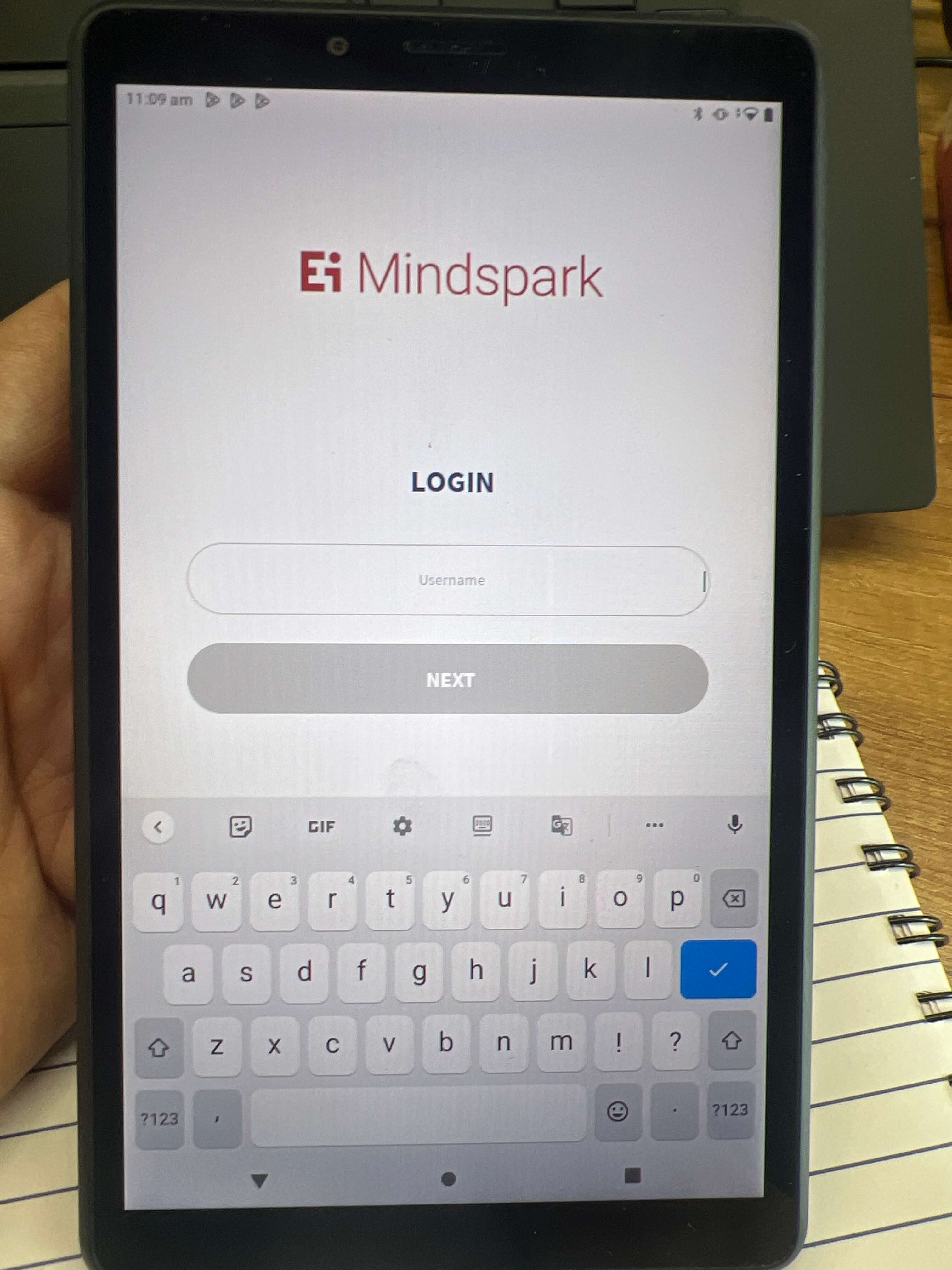
2. Improving Cursor Positioning on the Login Screen
Introduction
On the login page, the cursor is not positioned optimally, which can affect the overall user experience and aesthetic of the page. The cursor’s positioning plays a critical role in user interactions, and when it’s placed inconveniently, it can disrupt the flow of the page, making it harder for users to engage with the interface. This case study focuses on improving the cursor’s positioning to enhance usability and the visual appeal of the login page.
Problem
- Cursor Placement: The cursor is not ideally placed in the center of the input field or at a logical starting point, which can confuse users or create friction when attempting to interact with the page.
- Impact on Aesthetic and Usability: Poor cursor positioning creates an imbalance in the layout and potentially complicates the user experience by requiring extra clicks or actions to focus on the input field.
Why is this a Problem?
- Inconvenient Interactions:If the cursor is not placed at the appropriate starting point (e.g., the first text field or at the center of the page), users may need to manually click into the input field to begin typing, which creates unnecessary steps in an otherwise simple task.
- Aesthetic Disruption:Improper cursor placement can affect the overall design of the login page, making it feel disorganized or unpolished. This can give the impression of a lack of attention to detail in the interface.
- Frustration and Delay:Users expect intuitive and efficient interactions. Poor cursor positioning can lead to slight delays or confusion, which might affect users’ perception of the website or app’s quality.
Recommendations for Improvement
- Position the Cursor in the Center of the First Input Field:
- Place the cursor in the first input field (e.g., email or username) immediately upon loading the page. This ensures that users can begin typing without needing to click into the field first.
- Example: If the page has multiple input fields, the cursor should be placed in the first logical field, making it clear where the user should start.
- Ensure Logical Flow of Input Fields:
- After the cursor is placed in the first input field, ensure that the tab order between fields is logical, so users can smoothly move between fields using the “Tab” key without confusion.
- Example: If the login form includes “Username” and “Password” fields, the cursor should start in the “Username” field, and upon pressing “Tab”, it should move to the “Password” field.
- Align the Cursor with Visual Design:
- Positioning the cursor at the start of the form will also contribute to a more balanced and visually appealing layout, making the page look more organized and polished.
- Example: Make sure the form is centered on the page, so the cursor and input fields maintain a central visual position, improving both functionality and aesthetic appeal
- Fix Any Cursor Bugs:
- Address any existing bugs that may prevent the cursor from appearing in the correct location. This could involve fixing the positioning logic in the code or checking for conflicts with other UI elements.
Example: Before and After
- Before
- The cursor does not automatically appear in the input field or is positioned in an inconvenient place on the page, requiring the user to manually click into the field.
- After
- The cursor is automatically positioned in the center of the first input field when the login page loads, allowing users to begin typing immediately. This enhances usability and creates a more efficient login process.
Conclusion
Improving the cursor’s position on the login page is a small yet impactful change that can significantly enhance the user experience. By placing the cursor in the correct location upon page load, users can engage with the login form more intuitively, reducing friction and improving the page’s overall usability. This change aligns with UX principles such as efficiency, clarity, and usability, ensuring that users can interact with the interface quickly and easily.
3. Improving Accessibility in Interface Design
Introduction
The goal of this usability test was to assess the accessibility and usability of an interface design. The primary focus was to ensure the design was inclusive for users with various disabilities, specifically users who are deaf or hard of hearing. During the test, several issues were identified, including the lack of text-based alternatives for audio content and the inadequate text size.
Problem
Why is This a Problem?
- Lack of Text-Based Alternatives for Audio: Users who are deaf or hard of hearing cannot understand audio content if there are no captions or text-based alternatives. This directly impacts their ability to engage with the interface. In noisy environments, the absence of text alternatives further limits access for users who may rely on reading the content instead of hearing it.
- Small Text Size: When the text size is too small, it can lead to strain for users with visual impairments, reducing the overall readability and user experience. The absence of adjustable or legible text size creates unnecessary barriers for a significant portion of users, hindering usability and inclusivity.
Recommendations for Improvement
- Text-Based Alternatives for Audio:
- Implement captions or transcripts for any audio-based content. This would allow users who are deaf or hard of hearing to access the same information as those who can hear the audio.
- Example: If an audio question is used in the interface, there should be an option to display the question in text form on the screen as it is being spoken.
- Increase Text Size:
- Increase the default text size to a minimum of 16px to ensure readability for users with visual impairments.
- Additionally, make text size adjustable so that users can customize it based on their preferences, enhancing their experience.
Audio Example: Before and After
- Before
- The system plays an audio question but does not provide any text-based alternative. A user who is deaf or hard of hearing would not be able to understand the content.
- The text displayed on the screen is small and difficult to read, especially for users with visual impairments.
- After
- The system includes a text-based alternative to the audio content. The audio question is accompanied by an on-screen transcript that mirrors the spoken content, making the interface more inclusive.
- The text size is increased to 16px, making the content more legible. Additionally, users can adjust the text size according to their needs.
Conclusion
By addressing the issues related to text-based alternatives for audio and the small text size, the interface can be significantly improved in terms of accessibility and inclusivity. Implementing these recommendations will allow all users, including those with disabilities, to fully engage with and participate in the interface. This approach aligns with key UX principles such as perceivability, usability, and legibility, ensuring a more inclusive and user-friendly experience.
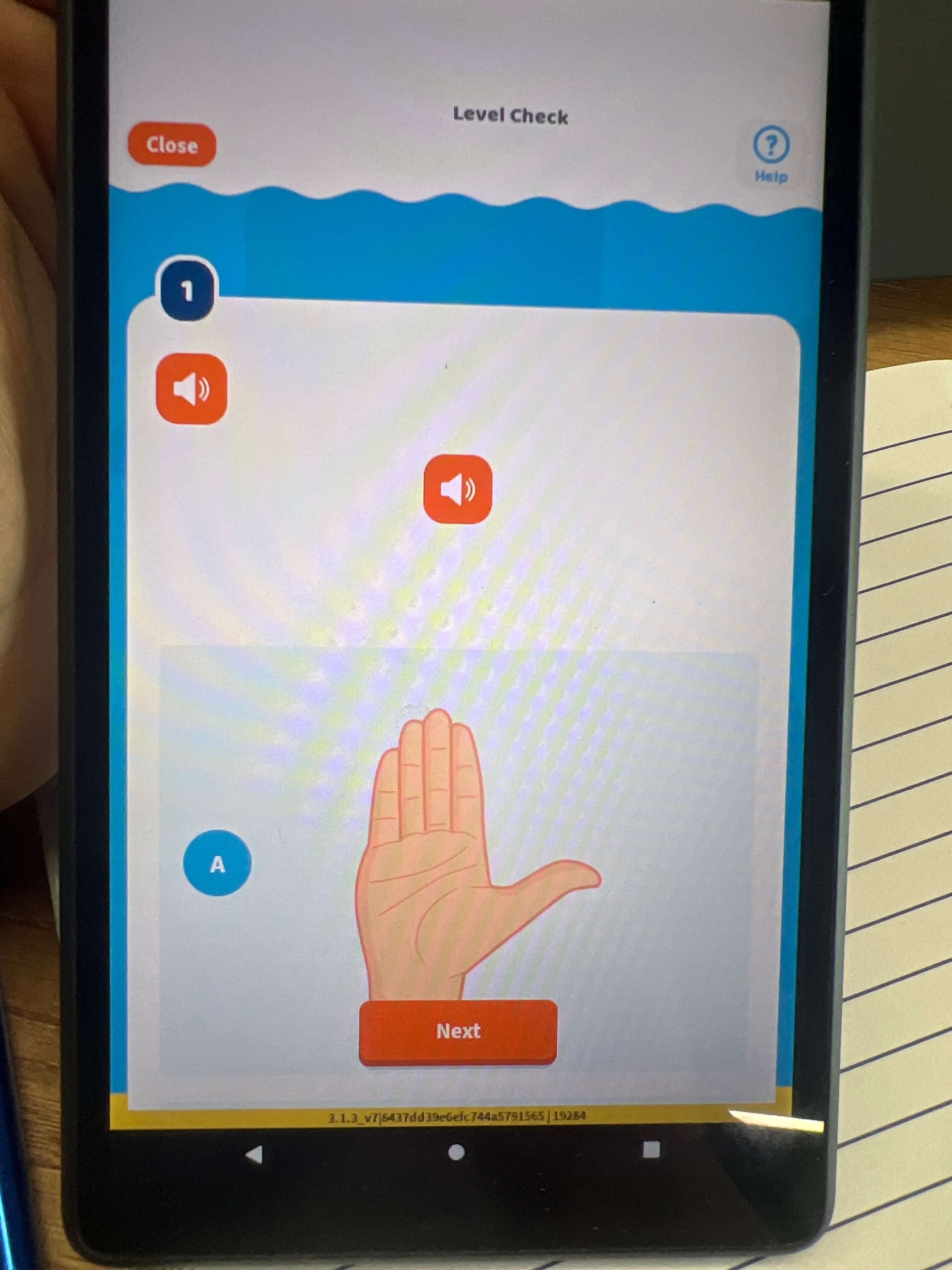
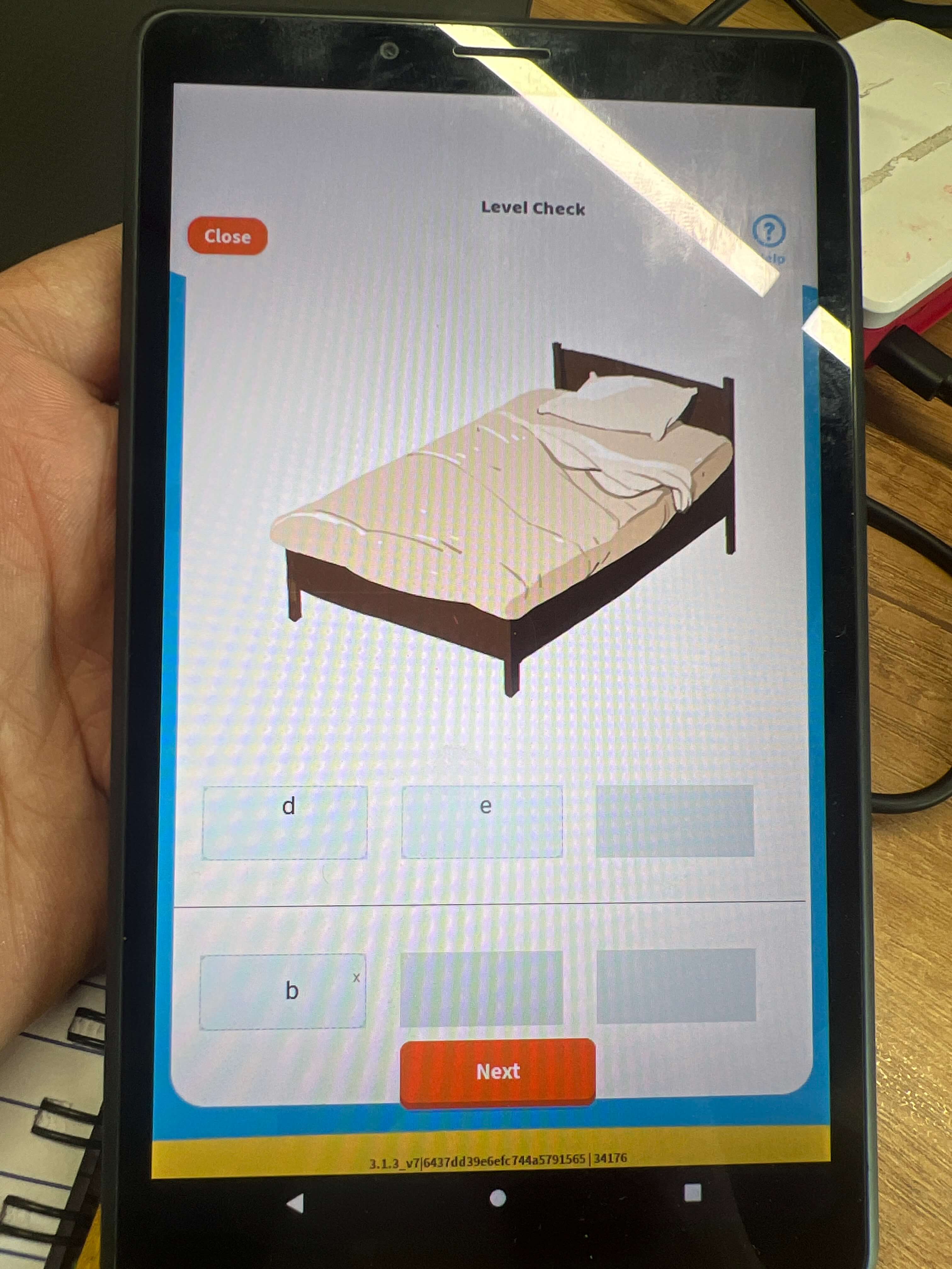
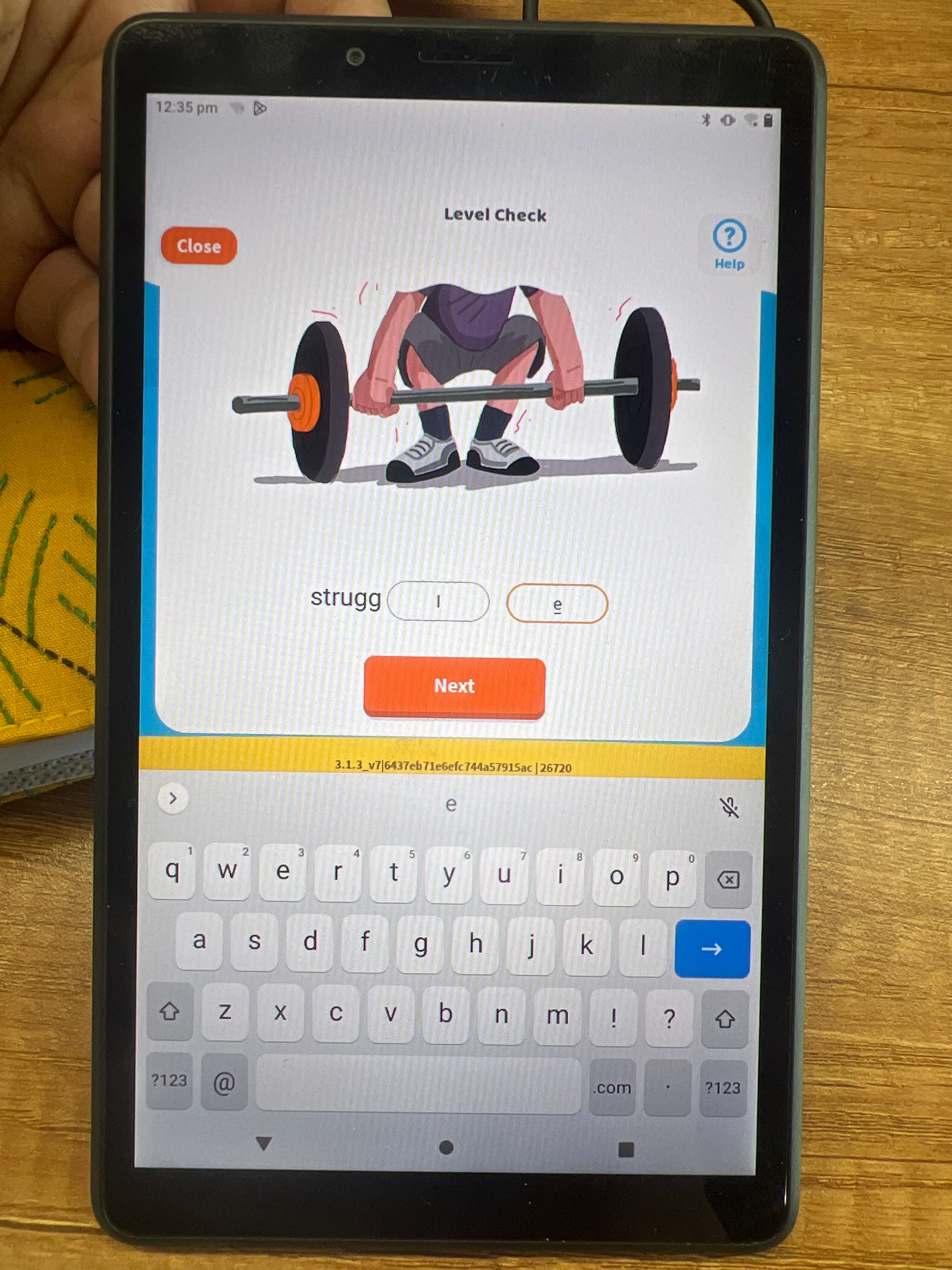
4. Improving Drag and Drop Functionality for Text Input
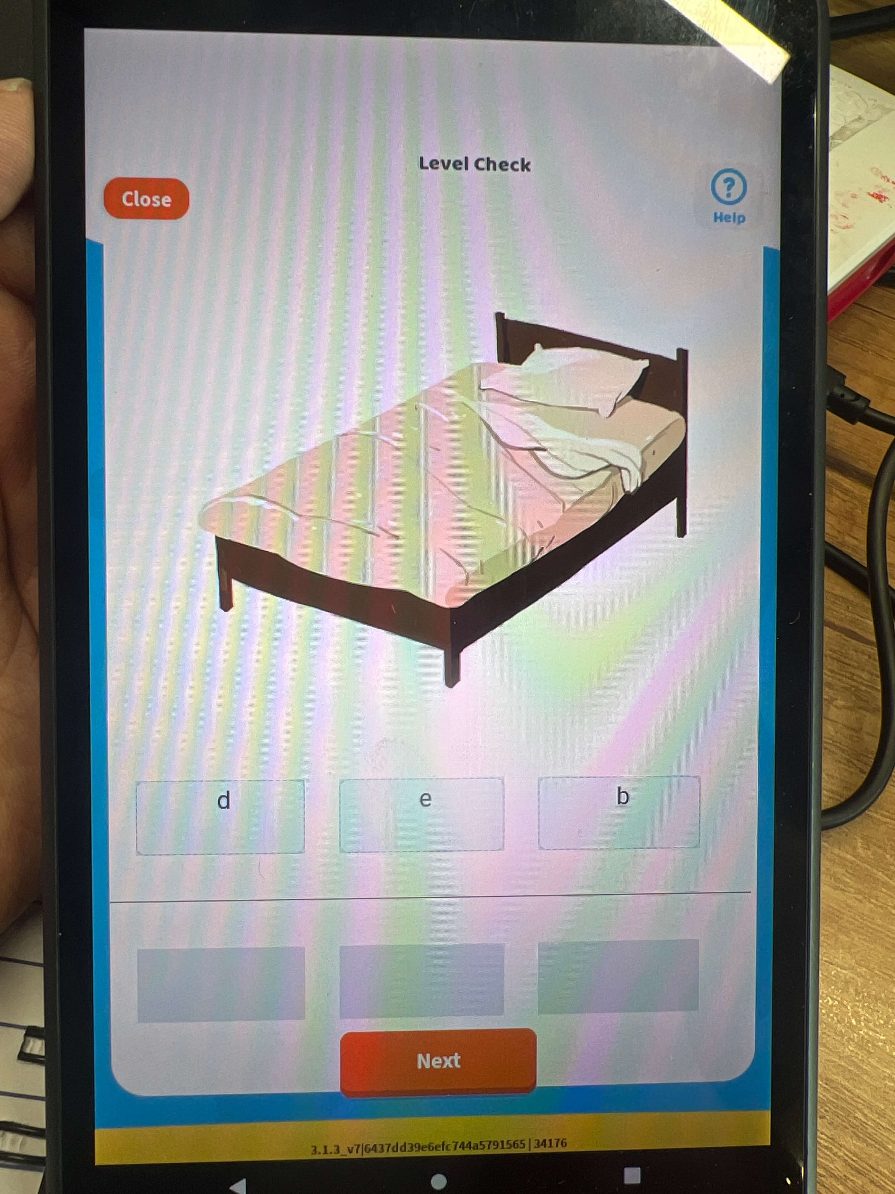
Introduction
During a usability test of a drag-and-drop input functionality, an issue was identified with the alignment of letters within the input box. The drag-and-drop functionality works smoothly, but the letter alignment is inconsistent, affecting the readability of the text. Additionally, the text size needs to be increased to ensure better legibility. This case study examines the problem, its impact on the user experience, and recommendations for improvement based on key UX principles.
Problem
- Letter Alignment: The letters in the input box are not properly aligned, which hampers readability. This issue is particularly noticeable when dragging and dropping letters into the middle of the text.
- Inadequate Text Size: The text size is too small, which affects users with visual impairments and reduces the overall readability of the input text.
Why is This a Problem?
- Impact on Readability: Proper letter alignment is crucial for readability, especially when using a drag-and-drop interface. Misaligned letters disrupt the flow of text and make it harder for users to read the input. This can cause confusion, especially when the user is trying to modify or correct text within the input box.
- Visual Discomfort: Small text size makes the content difficult to read for users with visual impairments or those in low-visibility environments. The absence of adjustable text size adds to the frustration, leading to a suboptimal user experience.
- Inefficient User Experience: The drag-and-drop functionality is meant to be a helpful tool for users to modify their input quickly. However, without proper alignment and legible text, this feature could become frustrating and less intuitive.
Recommendations for Improvement
- Fix Letter Alignment: Ensure that when letters are dragged and dropped into the input box, they are properly aligned. This can be achieved by using a grid or a flexbox layout to keep the text aligned consistently within the input box.
- Increase Text Size: Increase the default text size to a minimum of 16px to improve readability. This will ensure that users can easily read and modify the text without straining their eyes.
- Enhance Drag-and-Drop Feedback: Provide visual feedback when a letter is dragged, such as highlighting the drop area or adding subtle animations to guide the user. This will make the drag-and-drop process more intuitive and enjoyable.
Drag and Drop Example: Before and After
- Before
- The letters in the input box are misaligned, making it difficult to read the text, especially when modifications are made through drag-and-drop.
- The text size is too small, which makes it hard for users with visual impairments to engage with the content.
- After
- The letters are properly aligned, making the text readable and consistent, even when letters are dragged into the middle of the input box.
- The text size is increased to 16px, ensuring that all users can easily read and interact with the text.
Conclusion
By improving the alignment of letters within the input box and increasing the text size, the drag-and-drop functionality will become more intuitive and user-friendly. These changes align with key UX principles such as usability, readability, and user efficiency, ensuring a smoother and more accessible experience for all users.
5. Improving Close Icon Size and Alignment
Introduction
In a recent usability test, the close icon was identified as a potential issue within the interface. The icon is crucial for allowing users to exit windows, dialog boxes, or messages. However, its small size and poor alignment negatively impact accessibility and user experience. This case study highlights the problem and recommends improvements based on key UX principles.
Problem
- Small Close Icon: The close icon is currently too small, making it difficult for users to locate and click on it quickly.
- Improper Alignment: The close icon is not aligned properly within the interface, causing inconsistency in its placement, which can confuse users or make it less intuitive to interact with.
Why is This a Problem?
- Accessibility Concerns: A small close icon is harder to locate, especially for users with visual impairments or those with limited motor skills. This can lead to frustration and errors when trying to exit a dialog box or window.
- User Experience Impact: Poor alignment of the close icon can create an inconsistent and unpolished user interface, which negatively affects overall user experience. Users expect icons to be aligned in a logical and consistent way across the interface for ease of navigation.
- Efficiency Issues: A small and misaligned close icon forces users to take extra time to find and click on it, which can reduce the efficiency of the interaction. This becomes especially problematic in more complex interfaces where quick exits are necessary.
Recommendations for Improvement
- Increase Close Icon Size: The size of the close icon should be increased to at least 24px to ensure it is easily visible and clickable. This size increase makes it easier for users to interact with the icon without any difficulty.
- Proper Alignment: The close icon should be properly aligned within the interface, ensuring consistency with other elements. Aligning it with the edges of dialog boxes or windows can improve visual harmony and make the interface look more polished.
- Ensure Consistent Icon Styling: The close icon should follow the same style as other interactive elements on the page to maintain visual consistency.
- Before
- The close icon is small and difficult to locate, making it challenging for users to click on it when they need to exit a dialog box or window.
- The icon is misaligned, which disrupts the visual flow of the interface.
- After
- The close icon is increased to at least 24px, making it easier to locate and click on.
- The icon is properly aligned within the interface, providing a consistent and polished design.
Close Icon Example: Before and After
Conclusion
By increasing the close icon size and improving its alignment, the interface will become more accessible and user-friendly. These changes address key UX principles such as accessibility, efficiency, and visual consistency, ensuring that users can interact with the interface more effectively. Enhancing these elements will contribute to a smoother and more satisfying user experience.
6. Improving Vertical Alignment of Subject Names
Introduction
During usability testing of a content navigation interface, it was observed that the subject names were not vertically center-aligned. This issue significantly impacted the overall visual hierarchy and clarity of the design. Proper alignment is a key element in user experience, as it enhances readability and facilitates easier navigation. This case study will discuss the problem, its impact on the user experience, and recommended improvements.
Problem
The subject names in the content list were not vertically center-aligned. This misalignment created a disorganized and visually jarring experience, making it harder for users to scan and navigate the list. The lack of alignment caused confusion, as users had difficulty distinguishing where one subject ended and the next began.
Why is This a Problem?
Recommendations for Improvement
- Ensure Vertical Center Alignment: All subject names should be vertically aligned within their respective containers to create a balanced and cohesive visual structure. This alignment will enhance the overall clarity and organization of the content.
- Maintain Consistency: Ensure that vertical alignment is consistent across all subject names, regardless of their length or format. This will create a unified and professional appearance, enhancing the usability of the interface.
- Visual Testing: Conduct tests to ensure that the alignment holds up across various screen sizes and resolutions, ensuring consistency for all users.
Alignment Example: Before and After
- Before
- Subject names are misaligned, creating an uneven and cluttered appearance.
- Users struggle to scan and distinguish the items in the list.
- After
- Subject names are vertically center-aligned, making the list more organized and easier to read.
- The improved alignment enhances the scannability of the content, allowing users to quickly find the information they need.
Conclusion
By properly aligning subject names vertically, the interface will become more visually cohesive, clear, and user-friendly. These changes address important UX principles such as visual hierarchy, clarity, and ease of navigation, ultimately improving the overall user experience. Enhancing alignment will make the content more scannable and reduce cognitive load, allowing users to interact with the interface more efficiently.
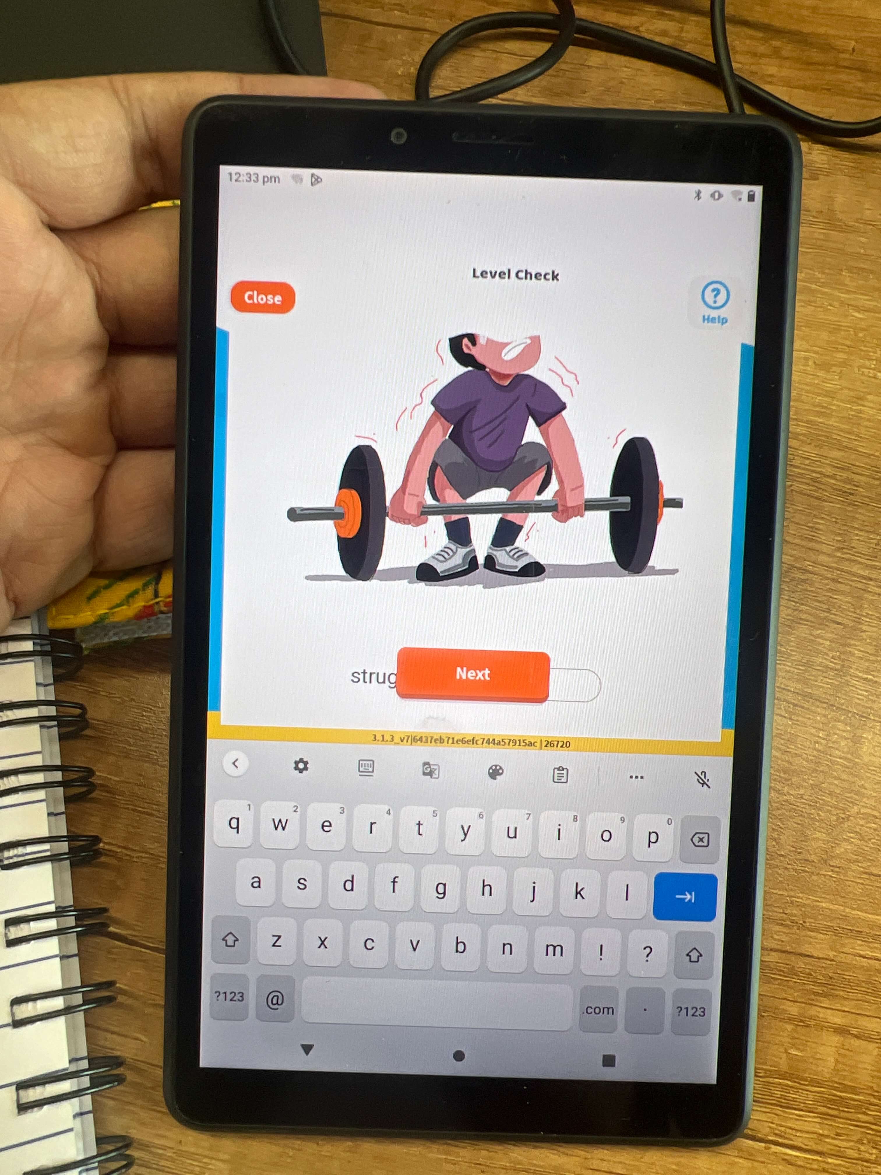
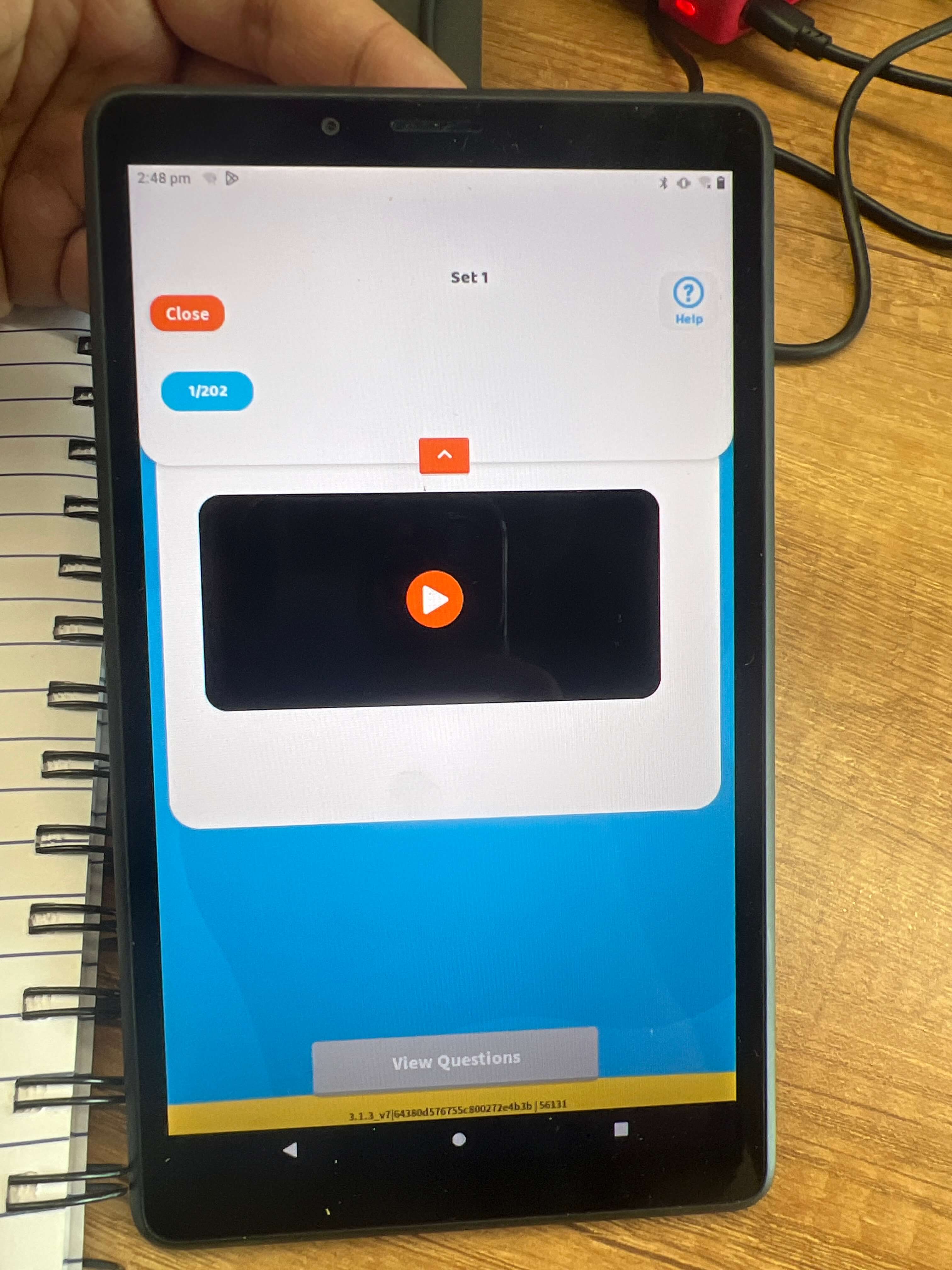
7. Improving Overlayed Keyboard on Input Fields

Introduction
In a recent usability test, an issue was found with the overlayed keyboard on input fields. When users interact with the input box, especially when it’s near the bottom of the screen, the on-screen keyboard overlaps the text input field, making it hard to see the text being typed. This can create frustration and confusion for users. This case study aims to explore the problem, its impact on the user experience, and propose recommendations based on UX principles.
Problem
The on-screen keyboard, when activated, overlaps with the input field, especially if the field is positioned near the bottom of the screen. This overlap hides the content the user is typing, preventing them from having a clear view of their input.
Why is This a Problem?
- Obscured Input Field: When the keyboard covers the input field, users cannot see what they are typing. This can lead to errors, confusion, and frustration, as users are unsure if their input is correct or if they’ve typed it properly.
- Interrupts User Flow: Having the keyboard overlap the input field disrupts the smooth flow of interaction, forcing users to either manually scroll or reposition the screen to see what they are typing.
- Decreased Usability: This issue creates inefficiency, especially in cases where users are filling out long forms or entering detailed information. They may need to move the keyboard away manually, which requires extra effort and interrupts the natural flow of the task.
- Implement Auto-Scroll: Introduce an auto-scroll feature that automatically moves the interface up when the user clicks on a text box, especially when it is positioned near the bottom of the screen. This ensures that the input box stays visible above the keyboard at all times.
- Position the Keypad Below the Input Box: Ensure that the on-screen keyboard is positioned below the input field and does not overlap. This can be achieved by adjusting the screen layout when the keyboard is activated, ensuring the field remains visible and the user can continue typing without obstruction.
- Smooth Scrolling Effect: Add a smooth scroll effect when the screen adjusts. This minimizes abrupt shifts and makes the transition seamless for users, reducing cognitive load.
- Test Across Multiple Devices: Ensure the auto-scroll feature and repositioning work across different devices and screen sizes, particularly for mobile devices with smaller screens.
- Before
- The on-screen keyboard overlaps the input field, making it difficult for users to see what they are typing, especially when the input field is near the bottom of the screen.
- The user is forced to manually scroll or adjust the screen, which disrupts their flow.
- After
- The interface automatically scrolls up when the user interacts with an input field, ensuring the text box is visible above the keyboard.
- The keyboard is positioned below the input field, preventing overlap and allowing users to see their input clearly.
Recommendations for Improvement
Overlayed Keyboard Example: Before and After
Conclusion
Implementing the auto-scroll feature and ensuring proper positioning of the on-screen keyboard will significantly improve the user experience. These changes will enhance usability, efficiency, and user flow, providing a more intuitive and seamless interaction. Addressing this issue will reduce frustration, improve task completion speed, and create a smoother overall experience for users.
8. Improving Header Spacing and Element Positioning
Introduction
During a usability test, it was observed that the header spacing in the interface was not optimized. The excessive space in the header area, combined with unclear information hierarchy and misaligned elements, caused inefficiencies and reduced the overall visual appeal. This case study aims to address the issues with header spacing and recommend improvements to enhance the user experience.
Problem
The header area contains excessive spacing between elements, and the content is not properly prioritized. Additionally, alignment issues with headings contribute to a less polished design. The inefficient use of space makes the interface appear cluttered or overly spacious, negatively affecting both functionality and aesthetics.
Why is This a Problem?
Recommendations for Improvement
- Reevaluate the Use of Space: Carefully analyze the content within the header and prioritize the most important elements. Reduce unnecessary white space and optimize the positioning of elements to make better use of the available space.
- Implement Consistent Spacing: Ensure consistent and well-proportioned spacing between elements within the header. This will create a balanced and organized appearance, improving both the aesthetic appeal and usability of the interface.
- Clear Information Hierarchy: Establish a clear hierarchy of information by adjusting the size and prominence of key elements (such as headings, logos, or navigation links). This will guide users’ attention to the most important content first.
- Fix Alignment Issues: Properly align headings and other elements in the header. This will improve the overall polish and professionalism of the interface, making it look more cohesive and visually appealing.
- Test Across Devices: Ensure that the spacing and alignment improvements work across different screen sizes and resolutions. This ensures consistency in the user experience, regardless of the device being used.
Header Spacing Example: Before and After
- Before
- The header has inconsistent and excessive spacing, leading to inefficient use of space.
- The alignment of headings and other elements is misaligned, making the design appear unprofessional.
- After
- The header is reorganized with optimized spacing, ensuring a more efficient use of space and a cleaner layout.
- The elements are aligned properly, creating a cohesive, balanced look that improves visual appeal and usability.
Conclusion
By improving the spacing and alignment of elements in the header, the interface will become more user-friendly, professional, and visually appealing. These changes address key UX principles such as efficiency, visual hierarchy, and usability, ultimately enhancing the overall user experience. Optimizing the header will make the interface more intuitive and easier to navigate, improving user satisfaction and task completion time.
9. Improving Overlapping Button on Input Field
Introduction
During usability testing, a design issue was identified where a button overlaps with the input field when the field is clicked. This overlap makes it difficult for users to interact with the interface efficiently. The problem can create frustration and hinder the user experience, particularly on smaller screens or devices. This case study explores the issue, its impact, and recommends solutions based on UX principles to improve the interface.
Problem
When users click on the input field, the button positioned nearby overlaps with the field, obstructing part of the screen. This overlap prevents users from seeing or interacting with the full input field and may cause confusion when trying to input text or complete a form.
Why is This a Problem?
Recommendations for Improvement
- Implement Auto-Scroll Feature: Introduce an auto-scroll feature that ensures the interface shifts upwards when the input field is clicked. This will move the input field above the button, ensuring that users can see and interact with the input field without obstruction.
- Reposition Design Elements: Reevaluate the placement of the button and input field. Consider repositioning the button further away from the input field or moving it to a different part of the screen to avoid overlap. This might involve adjusting the layout for better spacing and user interaction.
- Reduce Header Space: If the header space is too large, it may be pushing other design elements into close proximity. Reducing the header space can create more room for the interface, reducing the likelihood of overlapping elements when the input field is activated.
- Adjust Element Sizes or Spacing: Ensure that the input field and button have appropriate sizes and spacing between them. This will make the interface more user-friendly by preventing elements from crowding each other.
- Modify Code for Better Responsiveness: Ensure the code is responsive to user interactions. When a user clicks on the input field, the interface should adjust dynamically to accommodate the change, ensuring all elements remain visible and usable.
Overlapped Button Example: Before and After
- Before
- The button overlaps with the input field when clicked, blocking part of the field and making it difficult for users to interact with the input.
- The layout does not respond effectively to user actions, which may cause frustration or confusion.
- After
- The interface automatically scrolls upward when the input field is clicked, ensuring the input field remains visible above the button.
- The button is repositioned or resized to prevent overlap with the input field, creating a clearer and more organized layout.
Conclusion
By addressing the overlapping button issue, the interface will become more intuitive, user-friendly, and efficient. Implementing the auto-scroll feature, repositioning elements, and ensuring responsive design will improve both usability and visual appeal. These improvements will reduce frustration, increase task completion speed, and enhance the overall user experience. Properly handling overlapping design elements ensures a smoother, more enjoyable interaction for users.
10. Improving Input Field Size and Word Limit
Introduction
During usability testing, an issue was identified with an input field that was too large and lacked a character limit. The oversized input field allowed users to enter more text than necessary, creating an overwhelming and confusing experience. Additionally, users were not restricted to entering a single letter, which was the intended behavior for the task. This case study will explore the problem, its impact, and suggest improvements to create a more user-friendly interface.
Problem
The input field in the interface is too large, which can cause confusion for users, especially when only a small amount of text is needed. Additionally, there is no character limit in place, allowing users to enter more characters than required, which could lead to data entry errors or interface issues.
Why is This a Problem?
- Overwhelming Input Field Size: A large input field can visually overwhelm users, especially when the task only requires a single character or a limited amount of text. This may cause the user to feel uncertain about what is expected in that field.
- Lack of Word Limit: Without a character limit, users may enter more text than intended, leading to issues like data entry errors or content overflow. This can create confusion and make the interface feel less controlled.
- Inefficiency and Clutter: A field that allows excessive input or has an unnecessarily large visual area takes up space that could be better utilized for other design elements. It could also create clutter, making the interface feel less organized and harder to navigate.
- Increased Cognitive Load: When users are unsure about how much text they should enter, it increases cognitive load. A more appropriately sized field with clear constraints would help reduce this uncertainty.
Recommendations for Improvement
- Reduce the Size of the Input Field: Make the input field smaller to match the amount of text expected. For a field where only a single character is needed, limit the visual area to just enough space for that character to fit. This will make the interface cleaner and more focused.
- Set a Maximum Character Limit: Implement a character limit on the input field to restrict users from entering more text than necessary. For example, if the input is only intended to be a single letter, set a maximum character limit of 1. This will prevent users from accidentally entering too much text and ensure consistency in data entry.
- Clear Instructions and Feedback: Provide clear instructions or a placeholder text within the input field that indicates the expected input. For instance, “Enter one character” or “Maximum 1 letter” can help set expectations for the user. Additionally, feedback should be provided if users try to enter more than the allowed characters.
- Consistent Visual Design: Ensure that the input field size aligns with the overall design of the interface, maintaining a balanced and aesthetically pleasing layout. The input field should not be unnecessarily large, which could disrupt the visual flow of the page.
- Test Across Devices: Make sure the input field size and character limit work across various screen sizes, ensuring consistency in user experience regardless of device.
Input Field Example: Before and After
- Before
- The input field is large and visually overwhelming, with no clear constraints on the amount of text users can enter.
- Users can enter more text than needed, leading to potential confusion or errors.
- After
- The input field is resized to match the expected input (e.g., one character), making the design cleaner and less overwhelming.
- A maximum character limit is set, preventing users from entering more than the intended text and providing a more controlled, user-friendly experience.
Conclusion
By reducing the size of the input field and setting a character limit, the interface will become more user-friendly, efficient, and visually appealing. These changes address UX principles such as clarity, efficiency, and visual hierarchy, creating a more streamlined and intuitive experience. Reducing unnecessary input space and setting clear constraints will guide users in completing tasks more effectively and reduce potential errors.
11. Improving “Logout” Button Placement and Highlighting

Introduction
During a usability review of the question completion screen, it was observed that the “Logout” button was too prominently highlighted. This design choice can impact user experience by encouraging users to exit the interface prematurely, potentially interrupting their engagement with the content. This case study explores the issue with the “Logout” button and suggests improvements to make the interface more intuitive and engaging.
Problem
The “Logout” button is currently highlighted and placed in a conspicuous location, which may lead to users clicking it too often or before they have fully interacted with the interface. This can result in users prematurely leaving the interface, preventing them from engaging with the content fully. Additionally, highlighting the “Logout” button as a primary option distracts from more important tasks and actions users may need to complete.
Why is This a Problem?
Recommendations for Improvement
- De-emphasize the “Logout” Button: The “Logout” button should not be highlighted or placed in a prominent location. Instead, it can be positioned in a less conspicuous place, such as a top-right corner or within a menu, where it is still accessible but not encouraging premature exits.
- Replace with a “Home” Button: Instead of highlighting “Logout,” consider highlighting a “Home” button that encourages users to engage with the content or explore other areas of the interface. This will provide users with a clear and intuitive way to return to the main dashboard or starting point, rather than encouraging them to leave the interface entirely.
- Provide Clear Instructions or Prompts: Offer clear instructions or prompts within the interface to guide users on how to navigate and complete their tasks. For example, a message like “Complete your tasks before logging out” can gently encourage users to finish their interactions before exiting.
- Limit the Visibility of “Logout”: If users need to log out, provide an unobtrusive way to do so, such as hiding the “Logout” button within a settings menu or user profile dropdown. This reduces the likelihood of users clicking it by accident or out of habit.
- Ensure Clear Visual Hierarchy: Adjust the visual hierarchy of the interface to ensure that primary actions (such as completing tasks or exploring content) are more visually prominent than the logout option. This helps guide users toward engagement rather than exit.
Button Placement Example: Before and After
- Before
- The “Logout” button is highlighted and placed in a conspicuous location, making it the most prominent element on the screen.
- This placement encourages users to exit the interface prematurely, disrupting their engagement with the content.
- After
- The “Logout” button is moved to a less prominent location, such as a top-right corner or within a menu.
- A “Home” button is now highlighted, encouraging users to return to the main screen and engage with the content rather than logging out.
- The interface promotes task completion and exploration over premature exits.
Conclusion
By de-emphasizing the “Logout” button and replacing it with a more engaging “Home” button, the interface will encourage greater user interaction and participation. These changes align with UX principles such as user engagement, content prioritization, and visual hierarchy, leading to a more intuitive and satisfying experience. Ensuring that users are prompted to complete tasks and explore the interface rather than exit prematurely will increase user retention and overall satisfaction.
12. Improving Button Size and Spacing in Roadmap of Students Levels
Introduction
During a usability review of the “Roadmap of Students Levels” interface, an issue was identified with the button size and spacing. The buttons are currently large and positioned too closely together, creating a congested and disorganized look. This case study examines the problem, its effects on user experience, and provides recommendations for improvement based on UX principles.
Problem
The buttons on the roadmap screen are large and too close together, which creates a cluttered appearance. This makes it difficult for users to distinguish between different options, potentially leading to confusion or mistakes when interacting with the interface. The lack of visual separation between buttons makes the overall design feel cramped and less intuitive.
Why is This a Problem?
Recommendations for Improvement
- Decrease Button Size: Reduce the size of the buttons to prevent them from appearing too overwhelming. Smaller buttons can make the interface look cleaner and more organized, improving overall usability.
- Increase Spacing Between Buttons: Add margin space between the buttons to create visual separation. This will allow users to more easily distinguish each option, leading to improved navigation and a less congested interface.
- Balance Button Size and Spacing: Carefully balance the size of the buttons with appropriate spacing to maintain a clean and visually appealing layout. Ensure that buttons are large enough for easy interaction but not so large that they overpower the screen.
- Maintain Visual Consistency: Ensure that the button sizes and margins are consistent across the interface, creating a sense of harmony and balance. Consistency in design helps users predict where actions are located, improving usability.
- Test on Multiple Devices: Ensure that the button size and spacing work well across various devices, including mobile, tablet, and desktop. Responsive design adjustments may be needed to maintain the visual balance on different screen sizes.
Button Spacing and Size Example: Before and After
- Before
- Buttons are large and placed too closely together, creating a congested and cluttered look.
- Users may find it difficult to select the correct option or may become distracted by the lack of visual separation.
- After
- Button sizes are reduced to create a cleaner and more organized interface.
- Adequate spacing is introduced between the buttons, allowing users to clearly identify each option and navigate the interface more easily.
- The interface now appears balanced and visually appealing, improving overall usability.
Conclusion
By adjusting the size and spacing of the buttons, the interface will become more user-friendly and visually appealing. These changes will improve navigation, reduce cognitive load, and create a more intuitive user experience. Balancing button size with proper spacing aligns with key UX principles such as clarity, efficiency, and visual hierarchy, leading to a more satisfying and streamlined user interaction.
13. Improving Header Spacing and Dropdown Menu Layout
Introduction
In a recent usability test of the interface, it was noted that the header space was excessive, and the dropdown menu displaying questions or set numbers was unnecessary. This created an inefficient use of space and contributed to visual clutter. This case study will explore the problem with the header layout and provide recommendations for improving its design to create a more streamlined and user-friendly experience.
Problem: Text Size in Input Fields is Too Small
The header space is too large, resulting in wasted screen real estate that could be better utilized. Additionally, displaying questions or set numbers in the dropdown menu is redundant and occupies unnecessary space in the header. This issue contributes to a cluttered visual design, where the top section of the interface feels overloaded with information.
Why is This a Problem?
Recommendations for Improvement
- Revamp the Dropdown Menu:Remove the unnecessary display of question or set numbers in the dropdown menu. Instead, consider displaying this information in a smaller font next to the question or in the top right corner, where it doesn’t take up too much space. This will streamline the header and reduce clutter.
- Reduce Header Space:Consider reducing the overall height of the header to free up more screen real estate for the main content. This can be achieved by repositioning elements like the logo and navigation menu or using more compact fonts and spacing.
- Reposition the Logo and Navigation Menu:Realign the header elements (such as the logo and navigation menu) to improve balance and create a more harmonious layout. The logo can be moved to a more subtle position if needed, and the navigation menu can be adjusted for better visibility and user flow.
- Increase Usability with Clear Layouts:Organize the elements in the header in a clear and logical way to guide users toward the most important actions, such as accessing the main menu or completing tasks. Avoid cluttering the top section with unnecessary elements.
- Optimize for Responsive Design:Make sure that the reduced header space and adjusted layout work well across different devices. For mobile and tablet screens, ensure that the header elements remain accessible but do not dominate the screen space.
Header Layout Example: Before and After
- Before
- The header has excessive space, making the interface feel inefficient.
- The dropdown menu displays redundant information (e.g., question or set numbers), adding unnecessary visual clutter.
- The layout feels unbalanced, with the logo and navigation menu not aligned properly.
- After
- The dropdown menu is revamped to display essential information in a smaller font next to the question or in the top right corner.
- The header space is reduced, allowing more content to be visible on the screen, creating a cleaner and more organized layout.
- The logo and navigation menu are realigned for better balance, resulting in a more harmonious and visually appealing interface.
Conclusion
By optimizing the header space and revamping the dropdown menu, the interface will become cleaner, more organized, and easier to navigate. These changes address key UX principles such as space efficiency, visual hierarchy, and usability, leading to a more intuitive and satisfying user experience. Reducing visual clutter and ensuring a balanced layout will not only improve usability but also create a more polished and professional interface.
14. Improving Category Selection and Dropdown Menu Design
Introduction
During a usability review of the Category Selection interface, it was observed that the dropdown menu goes completely black when an option is selected. This makes it difficult for users to clearly identify the selected option. Additionally, the spacing between the category dropdown and the “Preview Button” is too small, creating a cramped layout. This case study aims to address these issues and provide recommendations to enhance the user experience.
Problem
- Visibility of Selected Option: The current dropdown menu turns completely black when an option is selected, which makes it hard for users to identify which option they have chosen.
- Spacing and Layout Issues: The dropdown menu is placed too closely to the “Preview Button,” causing a cramped and cluttered interface. This affects the overall visual appeal and usability of the page, making it harder for users to interact with the interface.
Why is This a Problem?
- Poor Visual Feedback: The lack of clear feedback when an option is selected creates confusion. Users rely on visual cues to confirm their actions, and when the dropdown menu turns black, it becomes difficult to distinguish between selected and unselected options.
- Overcrowded Interface: The small spacing between the category dropdown and the “Preview Button” results in a congested design. This can overwhelm users, leading to frustration or accidental clicks, and generally detracts from the overall usability of the interface.
- Difficult Navigation: With the current layout, it is harder for users to interact with both the dropdown menu and the “Preview Button” effectively. The lack of space and poor visual clarity hinders smooth navigation through the interface.
Recommendations for Improvement
- Change the Hover/Selection Effect:
- Replace the current black hover effect with a low-opacity or light color (e.g., light gray or soft blue) when an option is selected. This will enhance visibility and readability, ensuring that users can easily identify the selected option without confusion.
- Example: When a user selects an option, it could be highlighted with a light blue background, maintaining high contrast for easy readability.
- Increase Spacing Between Dropdown and Preview Button:
- Add adequate spacing between the category dropdown and the “Preview Button” to create visual separation. This will make the interface feel less cramped and improve the overall navigation by allowing users to interact with both elements more easily.
- Example: Ensure there is at least 20px of space between the dropdown and the button to avoid overcrowding.
- Optimize Layout for Consistency:
- Review the layout of the dropdown and button, ensuring that they align consistently with the rest of the interface elements. Realign the components to create a balanced and visually appealing layout.
- Example: Align the dropdown and button vertically or horizontally, depending on the interface style, and ensure that they are evenly spaced relative to other elements on the page.
- Test on Multiple Devices:
- Ensure that the dropdown and button interactions, as well as the spacing and hover effects, work well across different devices. Consider implementing responsive design principles to ensure that the user experience remains seamless on mobile, tablet, and desktop screens.
Example: Before and After
- Before
- The dropdown menu turns completely black when an option is selected, making it difficult to identify the selected option.
- The spacing between the dropdown menu and the “Preview Button” is too small, creating a congested and crowded layout.
- After
- A low-opacity or light-colored selection effect is applied to the dropdown, making it clear which option is selected and improving visibility.
- The spacing between the dropdown and the “Preview Button” is increased, creating a more open and user-friendly interface.
- The layout is adjusted to provide more balance and visual clarity, ensuring that the design feels organized and easy to navigate.
Conclusion
By implementing these changes, the Category Selection interface will become more intuitive and user-friendly. The new hover/selection effect will improve visual clarity, while the increased spacing and layout adjustments will reduce visual clutter and enhance the overall usability of the page. These changes align with UX principles such as visibility, clarity, space efficiency, and user control, creating a more effective and pleasant experience for users.
15. Improving Category Selection Input Field and Button Size
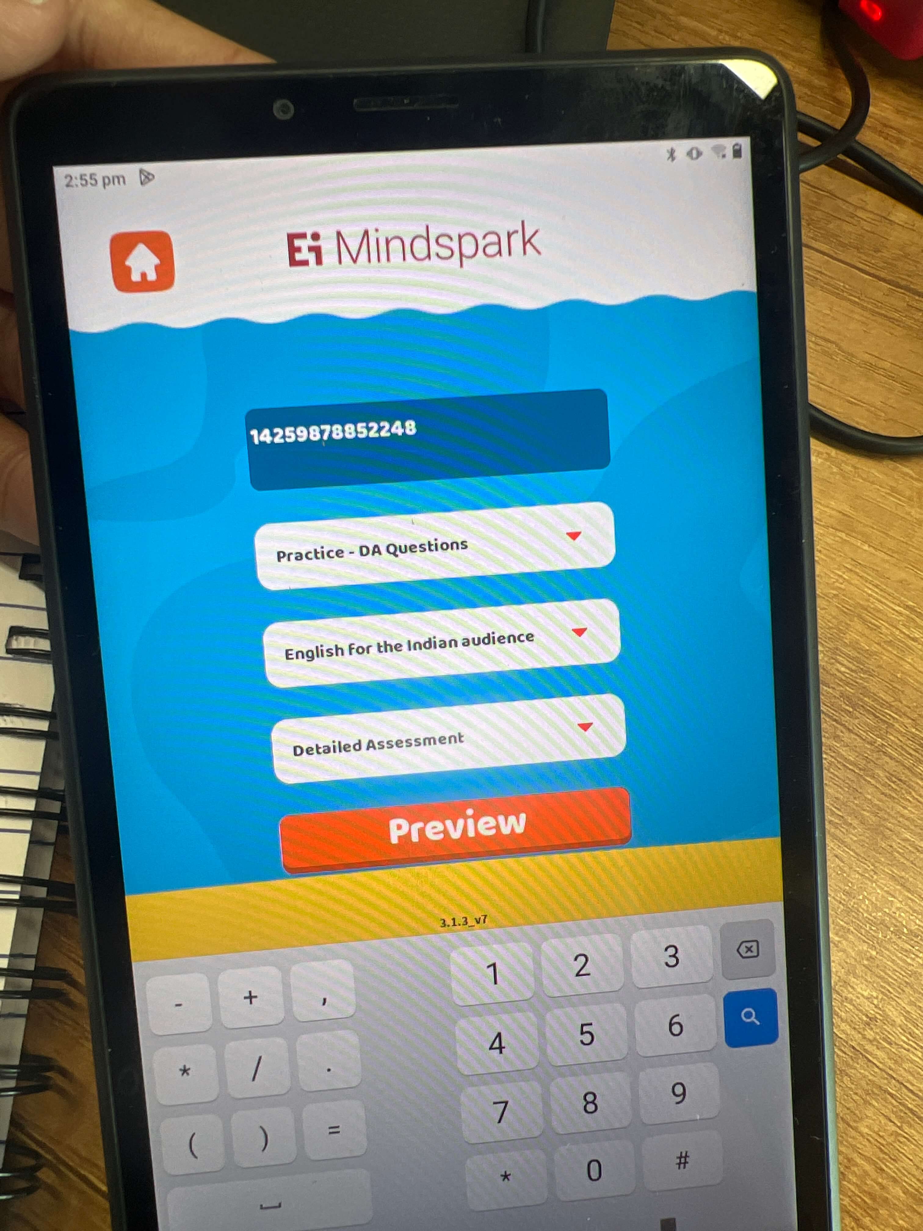
Introduction
In a recent review of the Category Selection interface, several usability issues were identified with the input field and button size. The button size was too large and inconsistent with the design, and there was inadequate spacing between the input box and the button. Additionally, the text input box didn’t clearly indicate what was to be written, and there was no word limit for the input, potentially leading to issues with incorrect entries. This case study will address these issues and suggest improvements to optimize the interface’s functionality and design.
Problem
- Button Size and Spacing: The button size is disproportionately large, which creates an imbalance in the layout. Furthermore, the spacing between the input field and the button is inconsistent, making the interface look disorganized.
- Unclear Input Field: The input field does not clearly communicate what information should be entered. Without a word limit, users may accidentally enter incorrect or excessive data.
- Error Handling: There is no feedback mechanism to alert users when an incorrect code (QCode) is entered, leading to a frustrating experience.
- Word Limit: The lack of a word limit in the input field could result in users inputting more text than necessary, which may affect the functionality and usability of the interface.
Why is This a Problem?
Recommendations for Improvement
- Adjust Button Size:
- Compress the button size to make it consistent with the design of the rest of the interface. The button should be large enough to be noticeable but not so large that it dominates the layout.
- Example: Reduce the button’s height and width to match the visual weight of other UI elements, ensuring a harmonious design.
- Optimize Spacing:
- Adjust the spacing between the text input box and the button so that it appears evenly distributed. Proper alignment will create a balanced and visually pleasing interface.
- Example: Ensure that there is consistent padding between the input field and the button (e.g., 16px or 20px), making the layout clean and easy to navigate.
- Clarify Input Field:
- Add placeholder text to the input field to clearly indicate what information is expected (e.g., “Enter QCode”). This will guide users and prevent confusion.
- Example: Include a placeholder like “Enter QCode” inside the text box to give users clear instructions on what to input.
- Implement Word Limit:
- Set a character limit on the input field to prevent users from entering excessive text. This will keep the input box size consistent and maintain the layout’s integrity.
- Example: Set the input field’s maximum character limit to match the expected input length (e.g., 6-8 characters for a QCode).
- Add Error Handling:
- Implement a validation system that checks if the entered QCode is correct. If an incorrect code is entered, show an error message prompting the user to try again.
- Example: Display an error message like “Invalid QCode. Please enter a valid code.” below the input field if the code entered is incorrect.
- Enhance Keyboard Design:
- Ensure the keypad is accessible and easy to use, with clear feedback for both valid and invalid entries. The keypad should be reachable and intuitive, as it currently enhances the interface’s usability.
- Example: Keep the layout of the keypad intuitive and ensure it remains responsive, allowing users to input data quickly and accurately.
Example: Before and After
- Before
- The button size is larger than necessary and disrupts the layout’s consistency.
- There is inadequate spacing between the input field and the button, creating a cramped look.
- The input field does not provide clear guidance on what to enter, and there is no word limit.
- No error message appears if the user enters an incorrect QCode.
- After
- The button size is reduced to be more consistent with the overall design, creating a more balanced layout.
- Spacing between the input field and the button is adjusted for better alignment and visual harmony.
- The input field now includes a placeholder text, guiding users on what to input.
- A word limit is implemented to prevent excessive text entry.
- If an incorrect QCode is entered, an error message is displayed below the input field, prompting the user to correct their input.
Conclusion
By making these adjustments, the Category Selection interface will become more user-friendly and visually appealing. Implementing proper button size, spacing, and input field constraints will create a more polished design, while adding error handling will improve the overall usability. These improvements align with key UX principles such as clarity, feedback, consistency, and efficiency, ultimately leading to a more effective user experience.
16. Improving User Feedback and Error Handling for Blank Page on Results Screen
Introduction
In a recent usability review of the results page, an issue was identified where, after submitting a request with an incorrect QCode, the user is faced with a blank page. This can be frustrating for users, as they are left unsure about the status of their request and without any guidance on what went wrong. This case study aims to address these issues and provide recommendations to improve user feedback and error handling on the results page.
Problem
- Blank Page Upon Incorrect Input: When a user enters an incorrect QCode, the system does not provide any feedback. Instead, it opens a blank page, which leaves the user confused and frustrated.
- Lack of Feedback: There is no indication of system activity or progress when the results are being generated, which creates uncertainty and can lead to a poor user experience.
Why is This a Problem?
Recommendations for Improvement
- Display a Loading Indicator:
- Add a loading spinner or progress bar to inform users that the system is working on generating the results. This will provide clarity on the ongoing process, ensuring users understand that their request is being processed.
- Example: Display a spinning circle or progress bar in the center of the page with a message such as “Generating results… Please wait.”
- Error Handling for Incorrect QCode:
- Implement error handling to prevent the system from opening a blank page when an incorrect QCode is entered. Instead, display an informative error message that clearly explains what went wrong and how to correct it.
- Example: If an incorrect QCode is entered, show a message like “Invalid QCode. Please check your code and try again.”
- Add a Message for Delayed Results:
- If generating results takes longer than expected, provide a message that explains the delay to the user. This can help manage expectations and reduce frustration.
- Example: Display a message such as “This may take a few moments. Thank you for your patience.”
- Prevent New Page from Opening with Invalid Input:
- If a wrong QCode is entered, prevent the system from redirecting to a new page. Instead, keep the user on the current page and show a clear error message.
- Example: If the wrong QCode is submitted, instead of opening a new page, display an error message in the same window or modal, allowing the user to correct the code without losing context.
- Improve Overall User Feedback:
- Ensure that all interactions, whether successful or erroneous, are followed by immediate feedback. This enhances trust in the system and improves the overall experience.
- Example: After submitting the correct QCode and generating results, display a success message such as “Results generated successfully!”
Example: Before and After
- Before
- Upon entering an incorrect QCode, the user is taken to a blank page with no feedback or indication of what went wrong.
- There is no loading indicator or progress bar when the system is generating results, leaving users uncertain about the status of their request.
- After
- When an incorrect QCode is entered, an error message is displayed within the same window, such as “Invalid QCode. Please check your code and try again.”
- A loading spinner or progress bar appears while results are being generated, accompanied by a message like “Generating results… Please wait.”
- If results take longer than expected, a message informs the user about the delay: “This may take a few moments. Thank you for your patience.”
- No new page is opened for incorrect input; instead, the user stays on the same page and can immediately correct the QCode.
Conclusion
By implementing these improvements, the results page will provide clear feedback, enhance user confidence, and prevent confusion. The loading indicator will inform users of system activity, while error handling will guide users when they enter incorrect information. These adjustments align with UX principles such as clarity, feedback, error prevention, and user control, ultimately improving the overall user experience.
17. Improving Layout and Accessibility for Overlapping Heading and Home Options
Introduction
A usability issue was identified with the heading and home options overlapping on the interface. This overlap affects the visual clarity of the layout, making it difficult for users to navigate. The overlapping elements are likely caused by layout constraints and the lack of word limits for the heading. This case study focuses on resolving these issues by recommending improvements in layout, font size, spacing, and accessibility.
Problem
- Overlapping Heading and Home Options: The heading and home options are overlapping, which creates a cluttered and confusing interface. This issue could be due to the heading text exceeding available space or a lack of constraints in the layout.
- Inconsistent Layout: The lack of proper spacing between elements leads to an unorganized and hard-to-read interface.
- Accessibility Concerns: The accuracy and question-done chips are not clearly distinguishable due to color choices, which affects accessibility for users with visual impairments.
Why is This a Problem?
Recommendations for Improvement
- Limit Heading Word Count:
- Set a word limit for the heading to ensure it doesn’t exceed the available space. This will prevent the heading from overlapping with other elements such as the home button.
- Example: If the heading is too long, shorten the text or implement a text truncation solution with an ellipsis (”…”) to indicate that there is more content.
- Improve Layout and Spacing:
- Adjust the layout to give proper spacing between the heading and the home option. This will prevent any overlap and improve the visual hierarchy.
- Example: Increase the padding or margin around the heading and home option to ensure they are well separated.
- Font Size Adjustments:
- Consider adjusting the font size of the heading and home options to fit within the layout constraints and maintain balance in the interface.
- Example: Reduce the font size of the heading if it causes overlapping or adjust the font size of other elements for better visual alignment.
- Enhance Accessibility with Color Contrast:
- Change the color of the accuracy and question-done chips to ensure better contrast and visibility, especially for users with visual impairments.
- Example: Use a high-contrast color scheme for these chips to make them more distinguishable (e.g., using a dark color for the text and a light background or vice versa).
- Fix Cursor Positioning:
- Address the cursor positioning bug that causes issues with user navigation. Ensuring the cursor is placed in an appropriate and intuitive location will improve the interaction flow.
- Example: Position the cursor in the search or input field automatically, so users can start typing immediately without needing to click first.
Example: Before and After
- Before
- The heading and home options overlap, making it difficult to distinguish between the two elements.
- The accuracy and question-done chips lack sufficient contrast, making them hard to read.
- The cursor positioning issue causes users to manually click to focus on input fields.
- After
- The heading has a word limit, preventing it from overlapping with the home option. Both elements are spaced appropriately, making them easy to navigate.
- The accuracy and question-done chips are now clearly visible due to improved color contrast, enhancing accessibility.
- The cursor is automatically placed in the input field, allowing users to start interacting without extra clicks.
Conclusion
By implementing these changes, the interface will be more visually organized, easier to navigate, and more accessible for all users. Limiting the heading word count, adjusting layout spacing, and improving accessibility features will enhance the overall user experience. These improvements are aligned with key UX principles such as clarity, consistency, accessibility, and user control, ensuring that users can interact with the interface smoothly and efficiently.
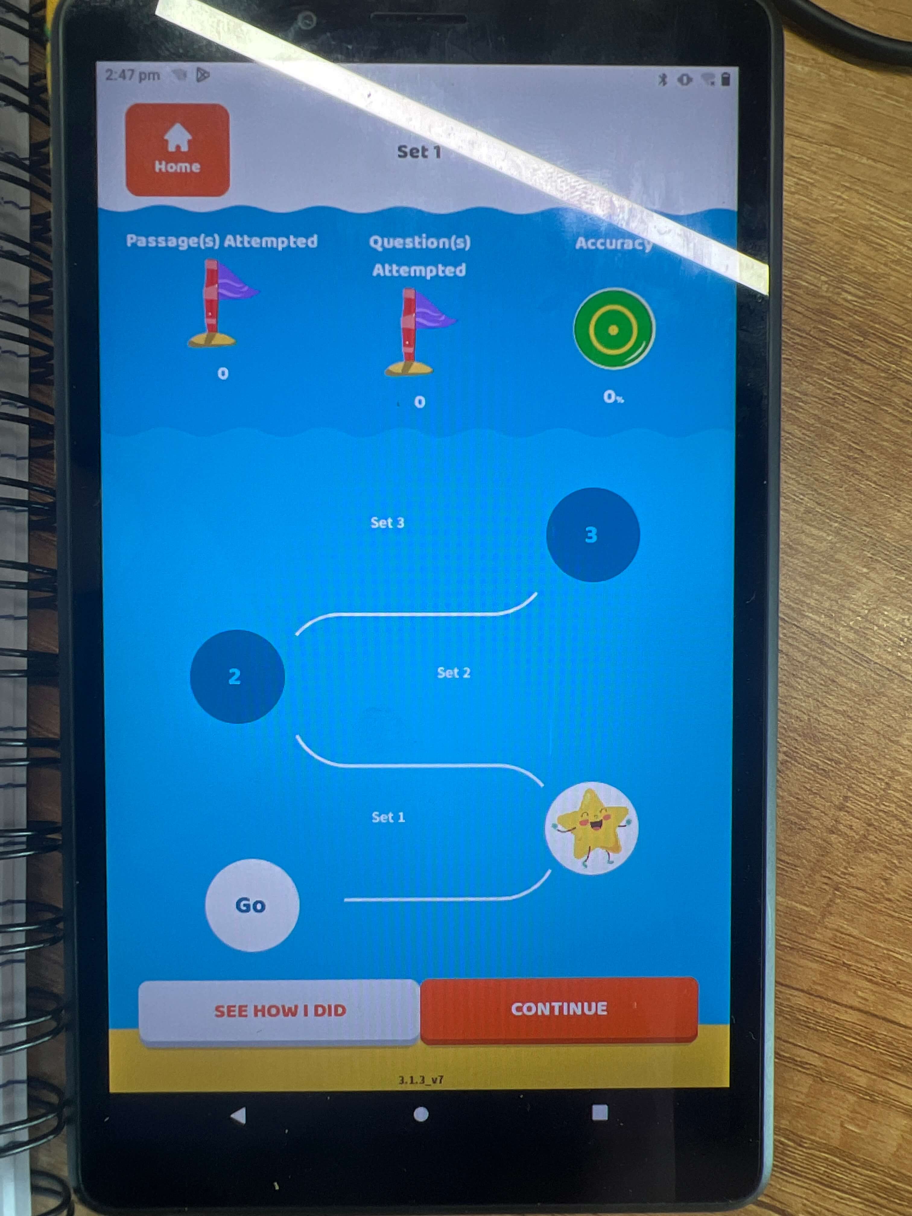
18. Improving User Experience on Completion of Questions and Return to Home Page
Introduction
Upon completing a series of questions, the user is directed back to the home page. However, some improvements need to be made to enhance the overall user experience, particularly regarding the visibility of the avatar and the layout’s balance. Currently, the avatar is not visible, and the interface could benefit from some margin adjustments to make it more visually appealing and user-friendly.
Problem
- Invisible Avatar: The absence of a visible avatar, especially when the user has not uploaded a profile picture, creates a gap in the visual consistency of the interface.
- Layout Imbalance: The lack of proper margin at the bottom makes the page feel cramped and incomplete. This issue leads to a lack of balance and harmony in the interface’s design.
Why is This a Problem?
- Inconsistent Visual Experience: When there is no default avatar displayed, the page appears incomplete, which may negatively affect the user’s experience. Users may expect to see a profile picture or a placeholder avatar, and the lack of it can lead to a sense of inconsistency.
- Cluttered Layout: Without proper spacing at the bottom, the page feels cramped, which affects the overall flow of the interface. It may lead to frustration for users, as they might feel that the design lacks polish.
Recommendations for Improvement
- Add a Default Avatar:
- Implement a default avatar that appears when the user has not uploaded a profile picture. This ensures consistency in the interface, and users will not encounter a blank or missing image, which can disrupt the visual harmony.
- Example: Use a generic avatar icon or a simple placeholder image that maintains the design’s overall aesthetic.
- Add Bottom Margin:
- Increase the bottom margin or padding in the layout to create better visual balance. This will make the interface appear more polished and less cluttered.
- Example: Introduce a margin at the bottom of the page to provide sufficient space between the content and the bottom edge of the screen, which will help in avoiding the cramped look.
- Adjust Layout with Padding:
- To maintain consistency, adjust the layout’s padding and margin properties to ensure that all elements have enough breathing space. This will enhance readability and ensure the design does not appear too compressed.
- Example: Ensure that the space between the avatar, text, and other page elements is well-distributed to make the interface more comfortable to navigate.>
Example: Before and After
- Before
- No default avatar is displayed when the user hasn’t uploaded a profile picture, leaving a blank space where the avatar should be.
- The bottom of the page feels cramped, with little to no margin or padding, making the interface appear unbalanced.
- After
- A default avatar appears in place of a missing user profile picture, creating a consistent visual experience.
- The bottom margin is increased, adding space and balance to the page. The layout feels more organized and user-friendly, providing a sense of completeness.
Conclusion
By adding a default avatar and improving the bottom margin, the overall user experience will be enhanced. These adjustments will ensure consistency in the interface, as users will always see a placeholder avatar when no profile picture is uploaded. Additionally, the extra bottom margin will create a more balanced and visually appealing design, improving the page’s overall usability. These changes align with UX principles such as consistency, clarity, and balance, ensuring that the user experience remains smooth and enjoyable.
