

Design System
B2B/B2C SAAS Product
B2B/B2C SAAS Product
My Role
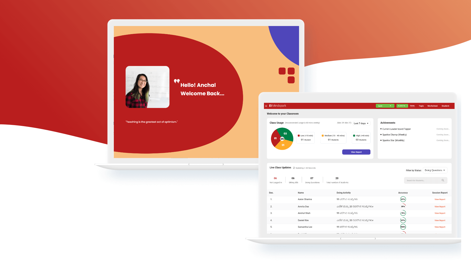
As the lead UX/UI designer, I was responsible for establishing a cohesive design system for the AmIBreached product—a web-based cybersecurity tool that allows users to check if their credentials have been exposed in data breaches.
Team
- Cross-functional team of 8
- Including front-end and back-end developers
- A product manager
- Cybersecurity analysts
Background
In early 2024, I began building AmIBreached, a standalone cybersecurity tool that allows users to check whether their credentials have been compromised in data breaches. Unlike most design system projects that begin with an audit of an existing product, this was a ground-up build—I created the entire platform from scratch, including the design, user flows, and interface logic.
There were no design artifacts, component libraries, or style guides. Every UI element—from buttons to table structures—had to be thoughtfully crafted to ensure visual consistency, scalability, and user trust, especially in a high-stakes domain like cybersecurity.
My Approach
1. Starting from Zero
Since I have knowldege of both the designer and the development, I had the unique advantage of tightly aligning the UI system. I didn’t just redesign, I architected the product interface with a systems mindset from day one.
2. Building the Foundations
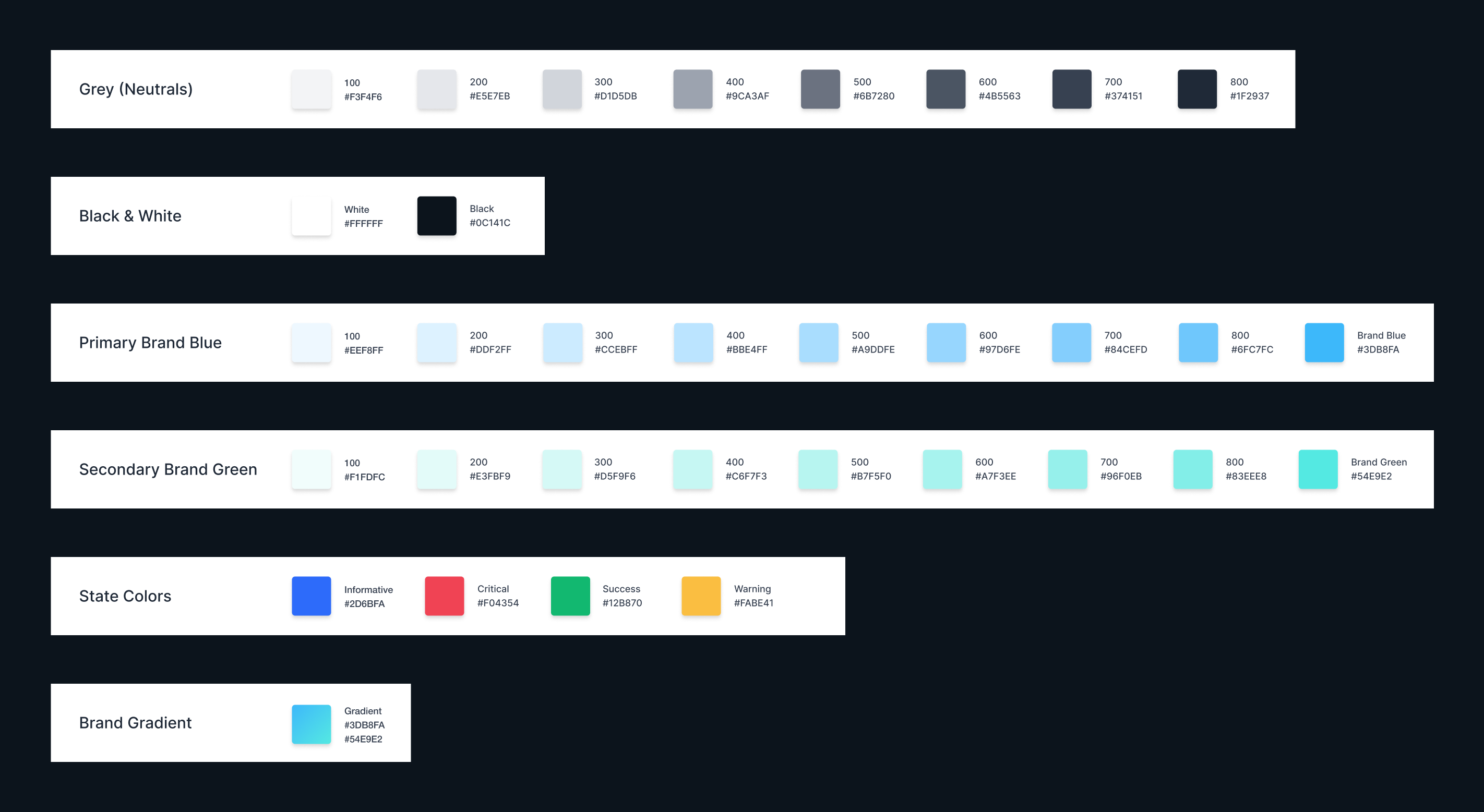
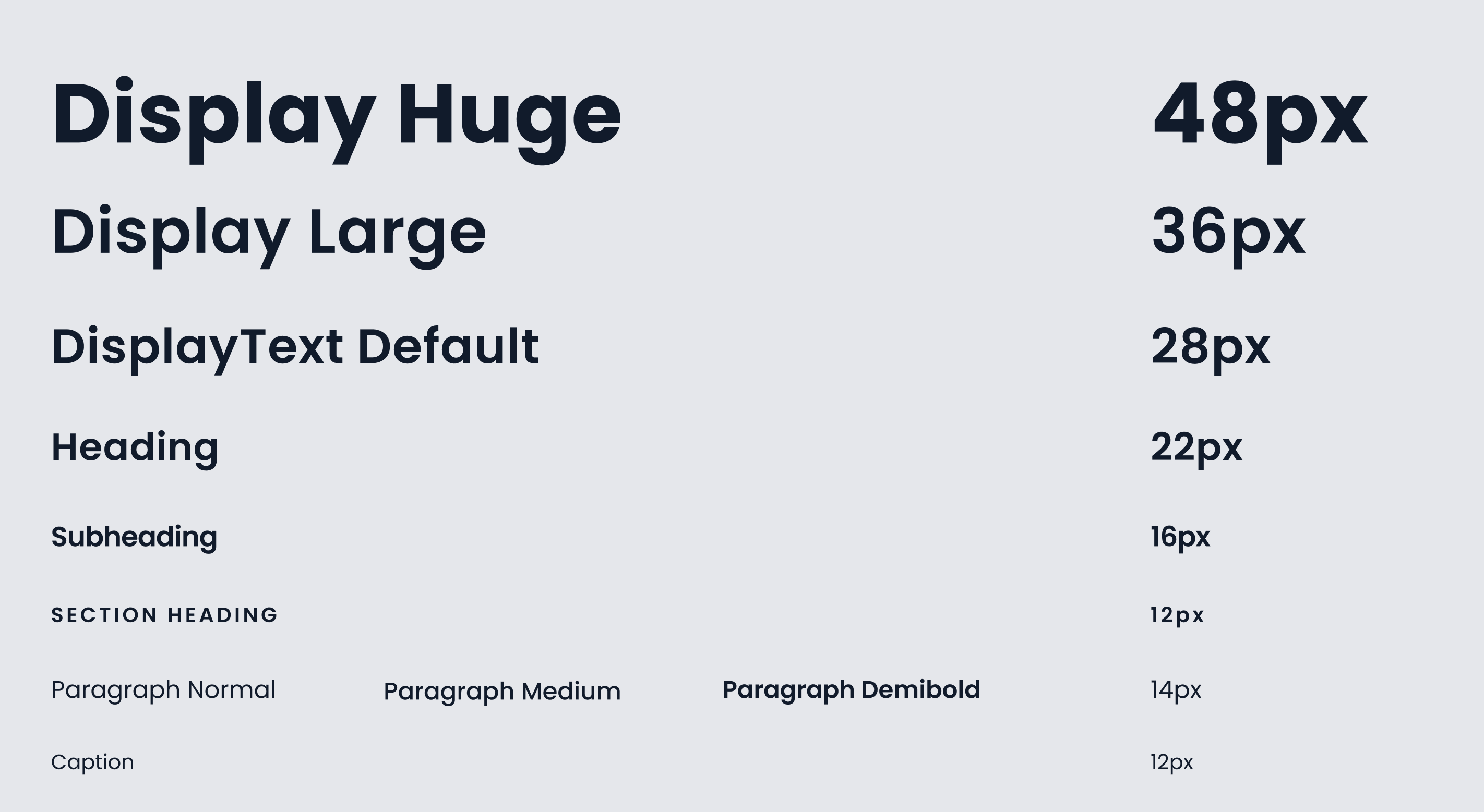
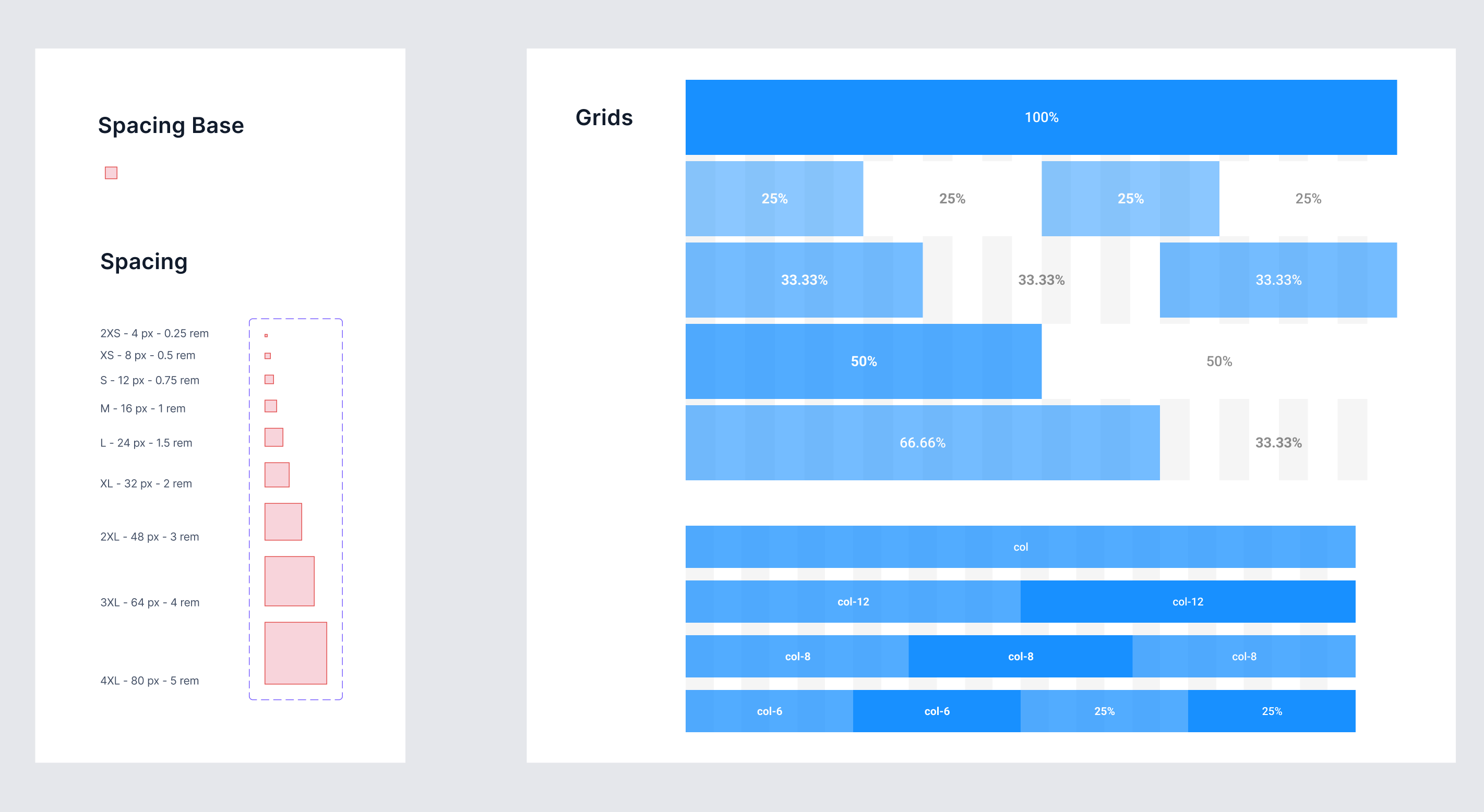
To ensure a scalable and maintainable UI, I began by setting up core design foundations in Figma:
- Color System: Defined semantic and brand color tokens (primary, success, warning, danger, neutrals) to support both usability and accessibility.
- Typography: Established a responsive type scale with consistent line heights and weights to improve readability.
- Spacing & Grid: Adopted an 8pt grid system and vertical rhythm to create visual balance across pages.
- Iconography: Designed a custom icon set, ensuring visual clarity and alignment with the product’s minimal, security-first aesthetic.
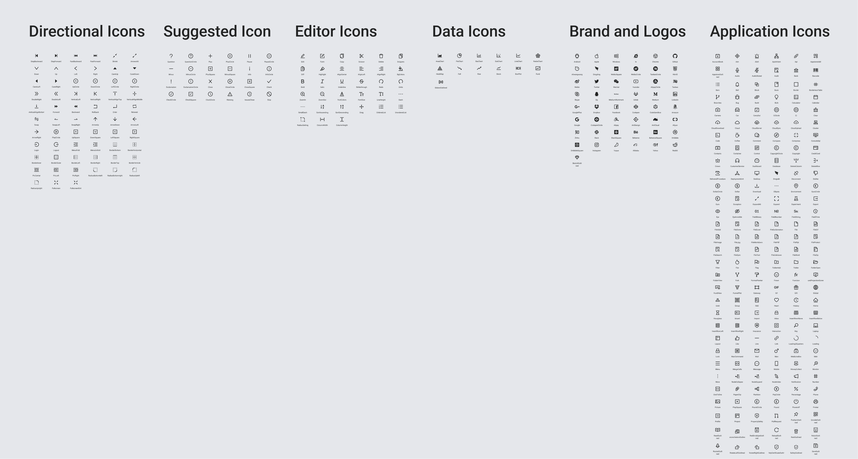
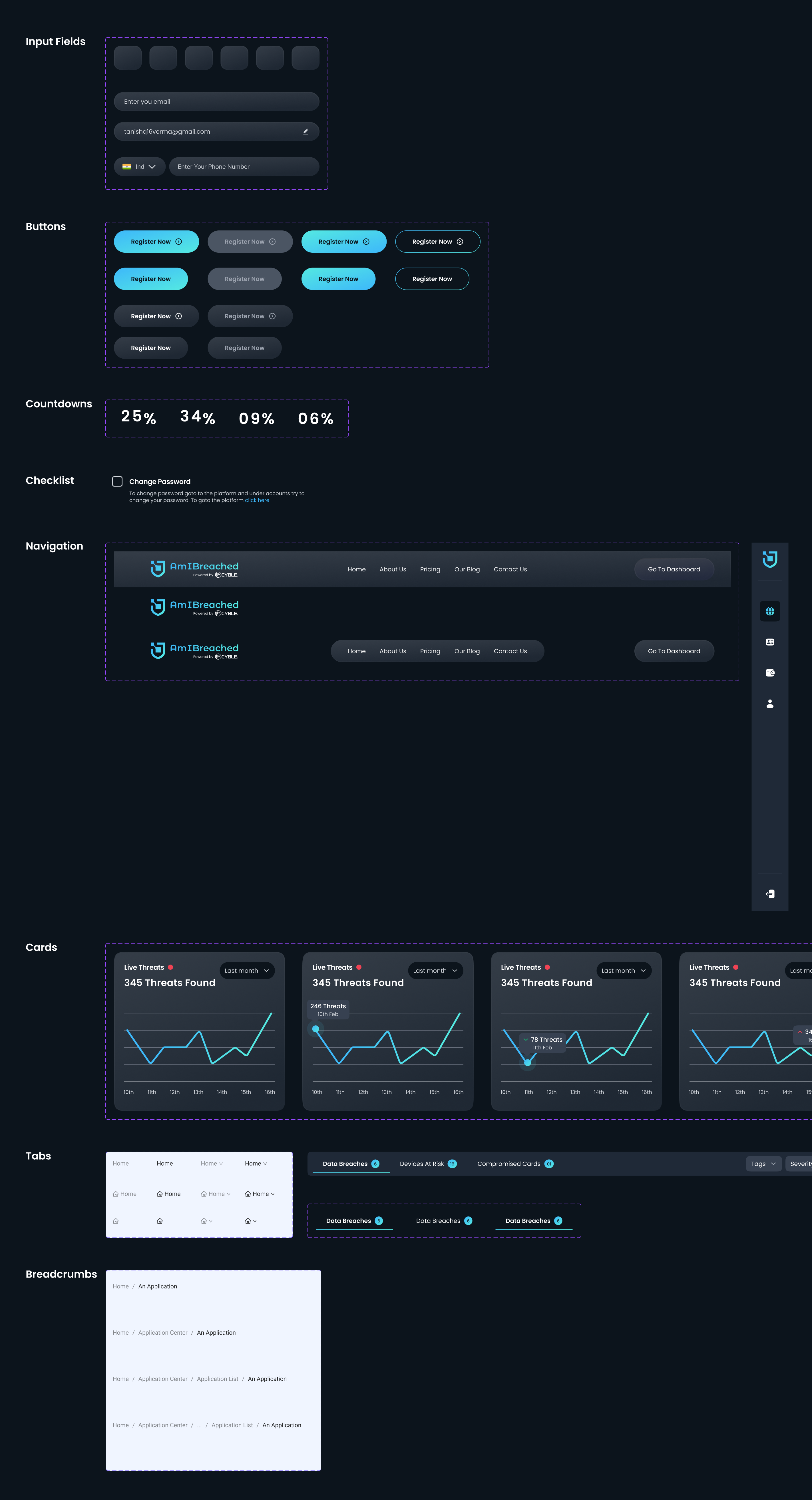
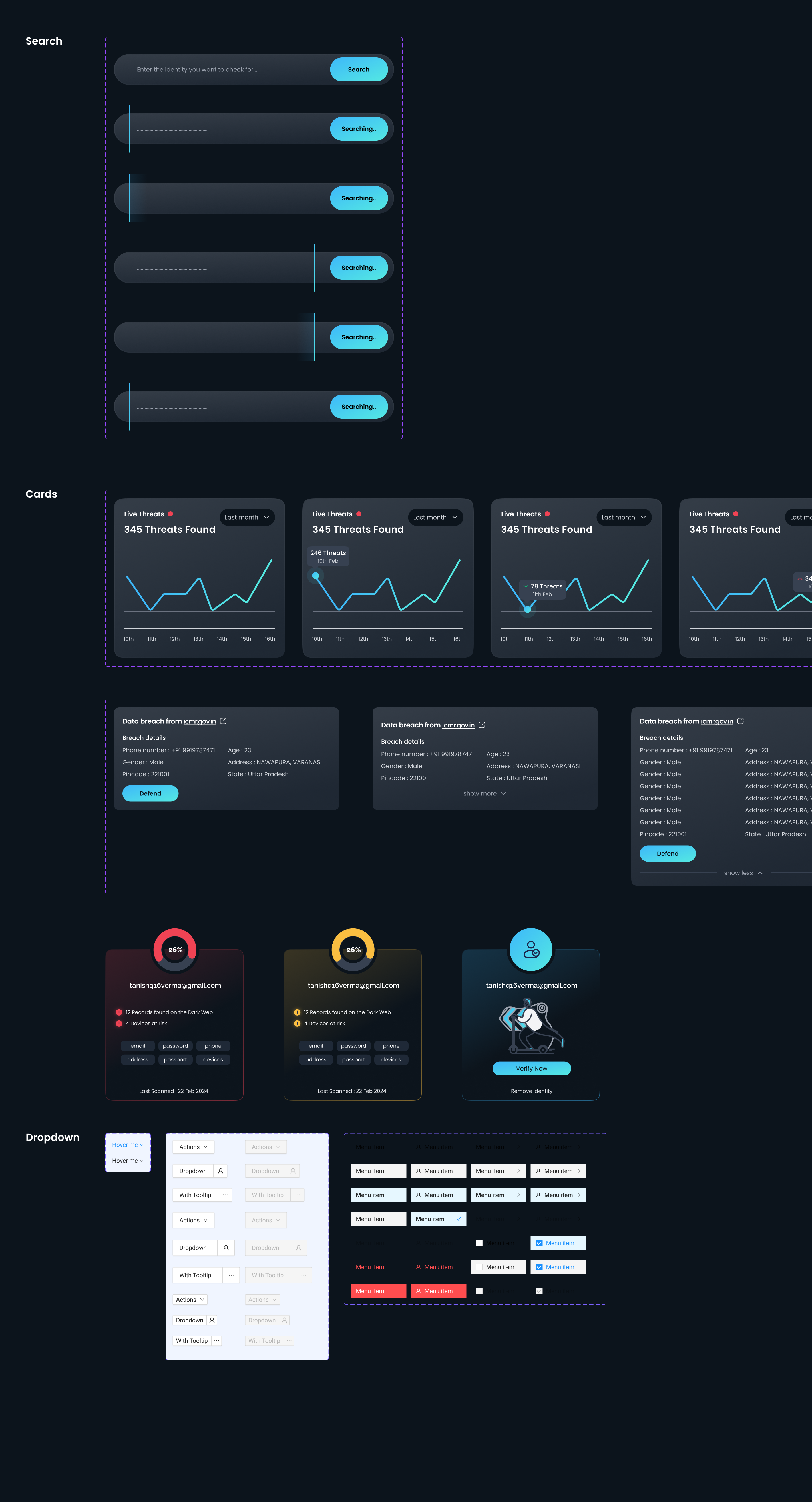
3. Designing Reusable Components
Once the design foundations were locked in, I created a modular component library in Figma. All components were built with auto layout, constraints, and variants to ensure they could adapt to different use cases.
The component set included:
- Buttons (Primary, Secondary, Destructive, Disabled)
- Input Fields (Text, Password, Search)
- Form Elements (Checkboxes, Toggles, Radios)
- Navigation Bars, Side Panels, and Footer Menus
- Tables with filters, sort, and pagination
- Notifications, Modals, Tooltips
Each component was documented for expected behavior, interaction states, and accessibility guidelines.
4. Future-Proofing with Design Tokens
Even though the MVP was built for a light theme, I used design tokens to prepare for future scalability:
- Color tokens mapped to both semantic purpose and visual styling
- Variables for spacing and typography to maintain consistency across breakpoints
- System organized to allow easy switching between light/dark modes
If I were to rebuild the system today, I’d implement themeable tokens at a global level, enabling one-click toggling between themes and improving maintainability across the design system.
Results
- Faster Design Iteration: Reusable components reduced new screen design time by 40%
- Smoother Dev Handoff: Tight alignment between Figma components and frontend code ensured high fidelity in execution
- Boosted User Trust: A clean, consistent interface improved perceived security and professionalism—a must in cybersecurity
- Scalable Growth: The system is now actively used to design and ship new features like breach history, identity monitoring, and user alerts without design drift
If I were to rebuild the system today, I’d implement themeable tokens at a global level, enabling one-click toggling between themes and improving maintainability across the design system.
Reflection
Creating the AmIBreached design system from scratch was a deep dive into product thinking, systems design, and full-stack implementation. This wasn’t just a design exercise—it was about building trust, establishing clarity, and laying the foundation for a secure and scalable user experience.
Being both the designer and developer allowed me to bridge the design-engineering gap effortlessly, but also taught me the value of early structure. Looking back, starting with atomic design tokens and a token-based theme architecture would have made things even more scalable. Still, the current system has significantly elevated both speed and consistency in product development.