Logo

Overall, the Ei Mindspark App - Naandi platform is a powerful educational tool that helps students learn at their own pace and in a way that works best for them. By leveraging technology to provide personalized learning experiences, the app helps students build their confidence, improve their academic performance, and reach their full potential.

Ei Mindspark App - Naandi is an educational platform designed to support students in their learning journey. The platform utilizes an adaptive learning system that leverages technology to personalize the learning experience for each student.

When a student first joins the platform, they are asked a series of questions to assess their current knowledge level. Based on the answers provided, the app determines the student's current understanding of the subject matter and places them at an appropriate knowledge level.

Once the student's knowledge level has been determined, the app provides a series of questions and exercises to help them upskill and improve their understanding of the subject matter. These questions are tailored to the student's knowledge level, ensuring that they are appropriately challenging and engaging.

The Ei Mindspark App - Naandi platform covers a wide range of subjects, including math, science, and English. The app is designed to help students build their confidence and improve their academic performance over time.

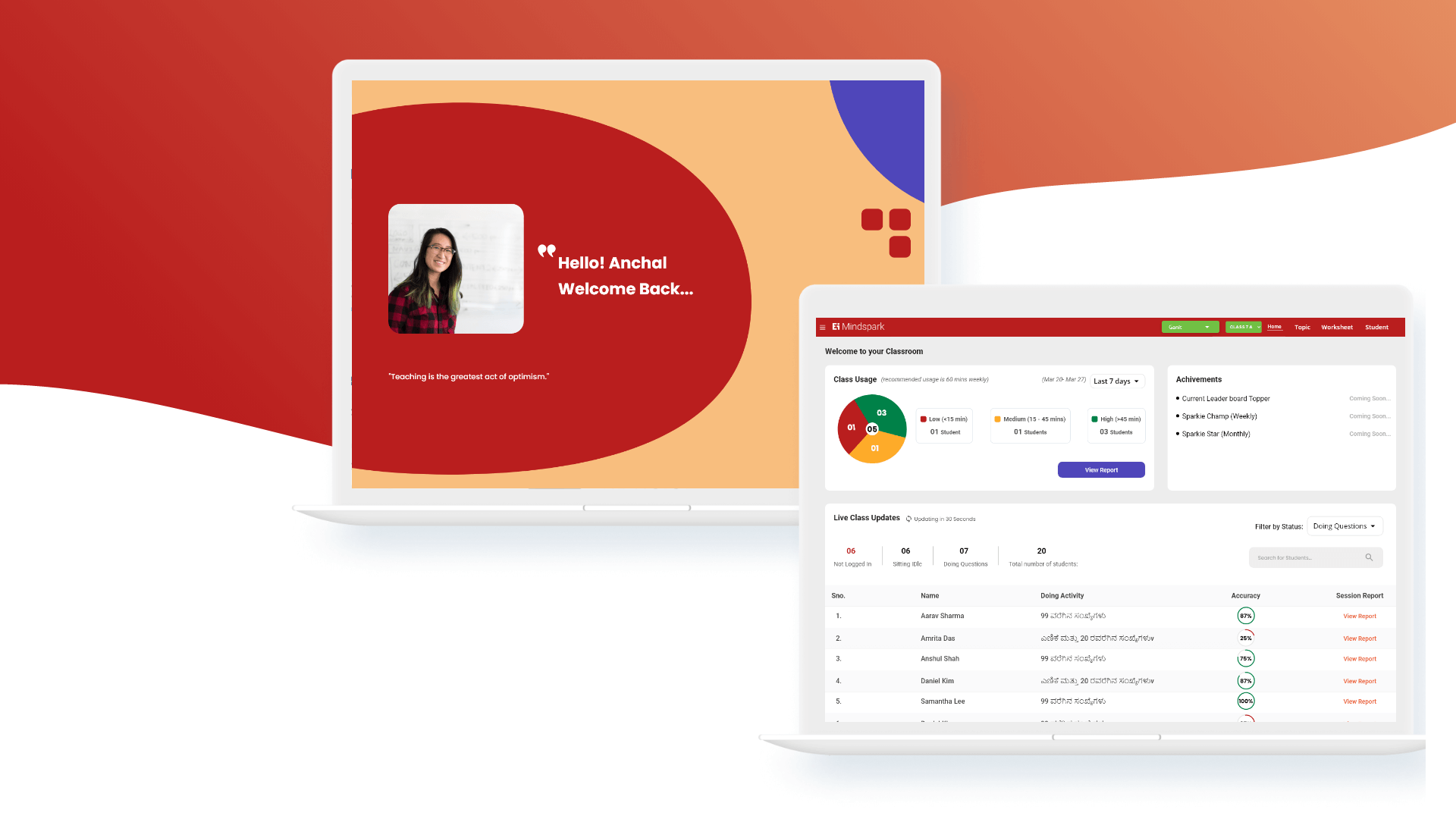
In addition to providing personalized learning experiences, the Ei Mindspark App - Naandi platform also offers teachers and parents insights into their child's progress. Teachers and parents can track their child's performance on the app, view detailed reports, and receive recommendations on how to support their child's learning outside of the platform.

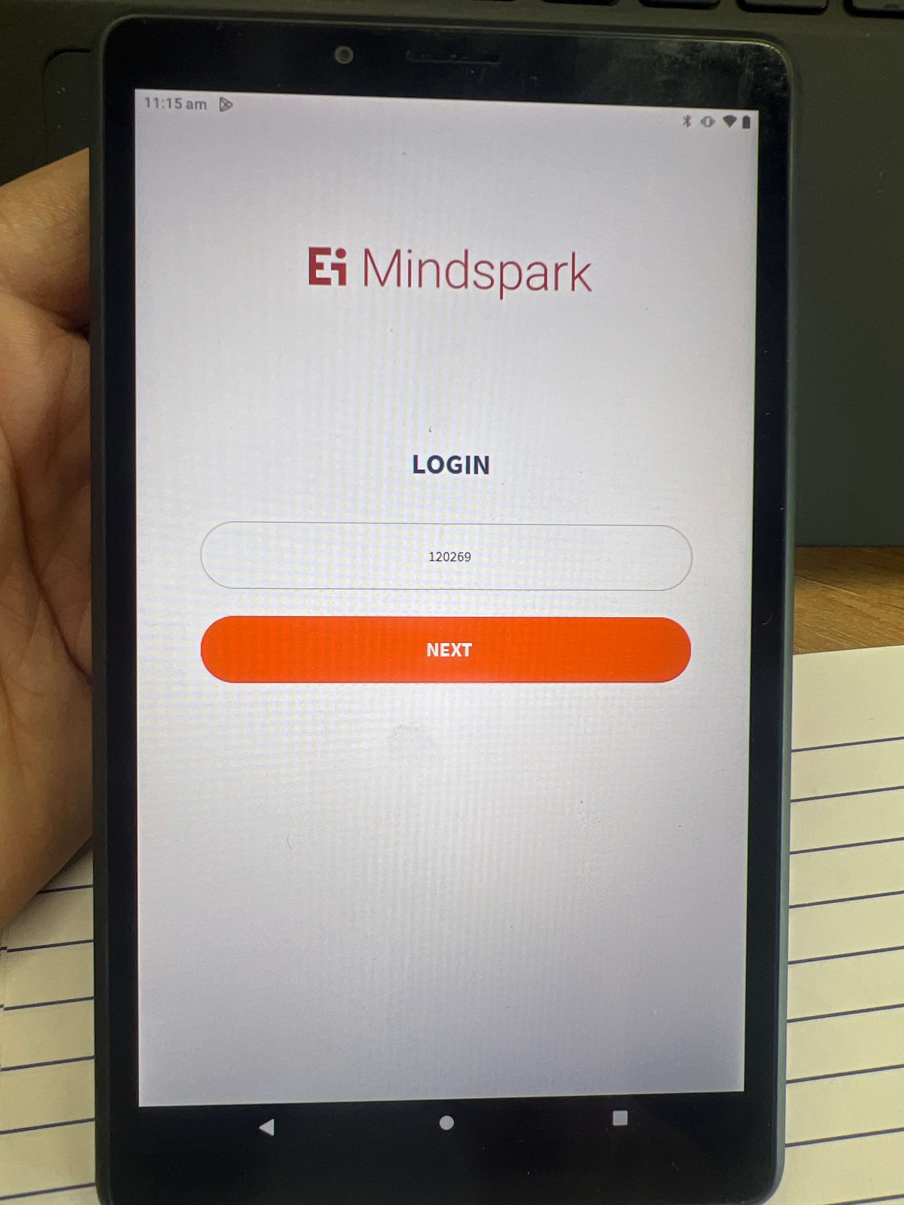
Login Screen - Curser
image

Need to Improve

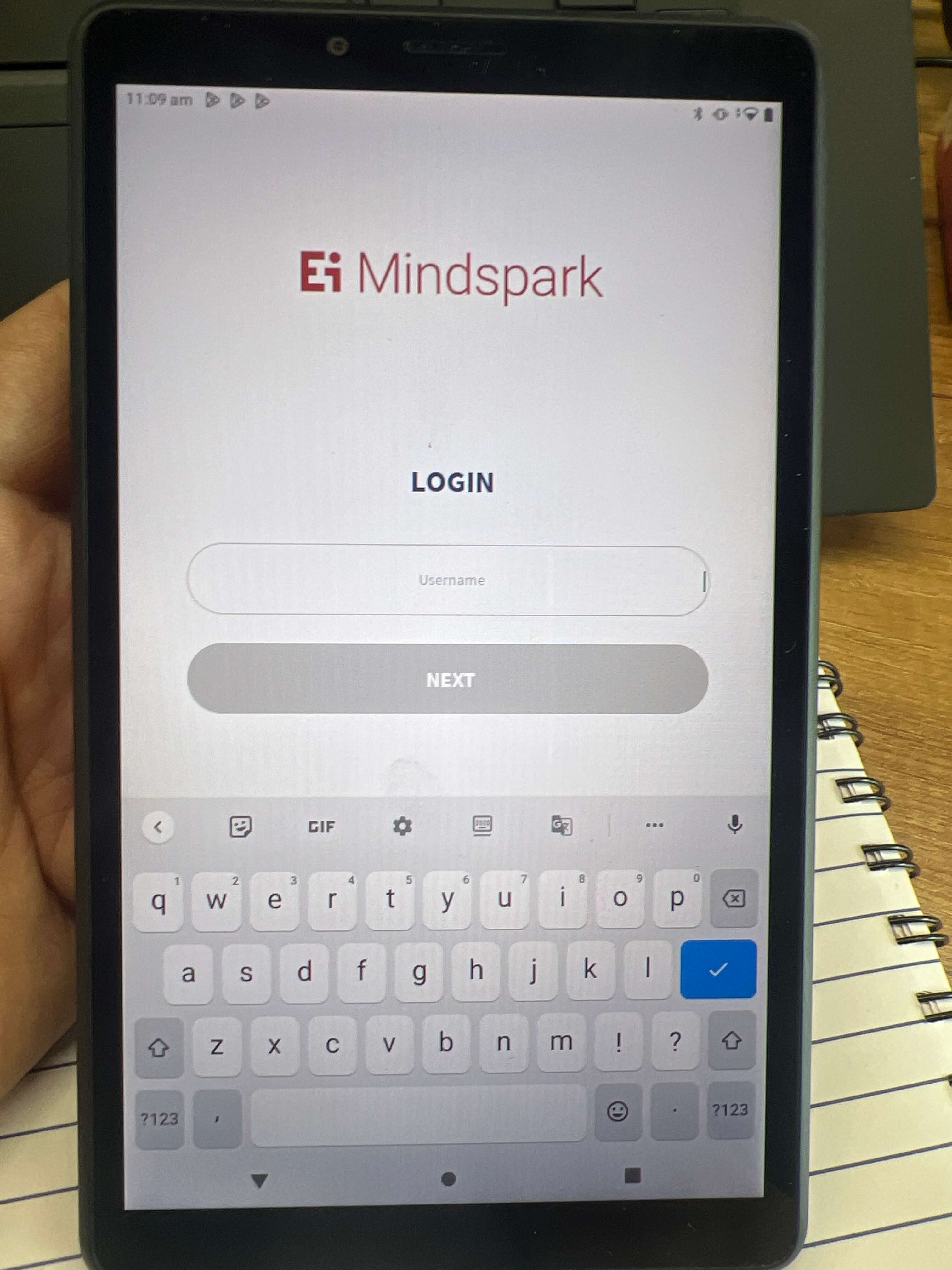
  • The cursor on the login page should be ideally placed in the center.
  • Placing the cursor in an inconvenient location can impact user experience.
  • The cursor position can affect the overall aesthetic of the login page.
  • A cursor in the center creates a balanced and visually appealing layout.
  • Proper cursor positioning can improve page usability and visual appeal.
  1. Issues/bugs found -Curser Positioning.
  2. What works well -The Login page loads quickly.
  3. What can be improved -The curser bug needs to be resolved.

Login Screen - Font Size

image

Need to Improve

  • Font size is important to consider in interface design, especially for input boxes.
  • Text that is too small can lead to user frustration and errors.
  • Increasing the font size to 16 pixels is recommended for optimal readability.
  • A larger font size can make input boxes more visually prominent and easier to locate.
  • Increasing font size can have additional benefits beyond readability.
  • Overall, increasing font size in input boxes can improve the user experience and aesthetic of the interface.
  1. Issues/bugs found -Text Size.
  2. What works well -The Login page looks good.
  3. What can be improved -The text size can be increased to a minimum of 16px.

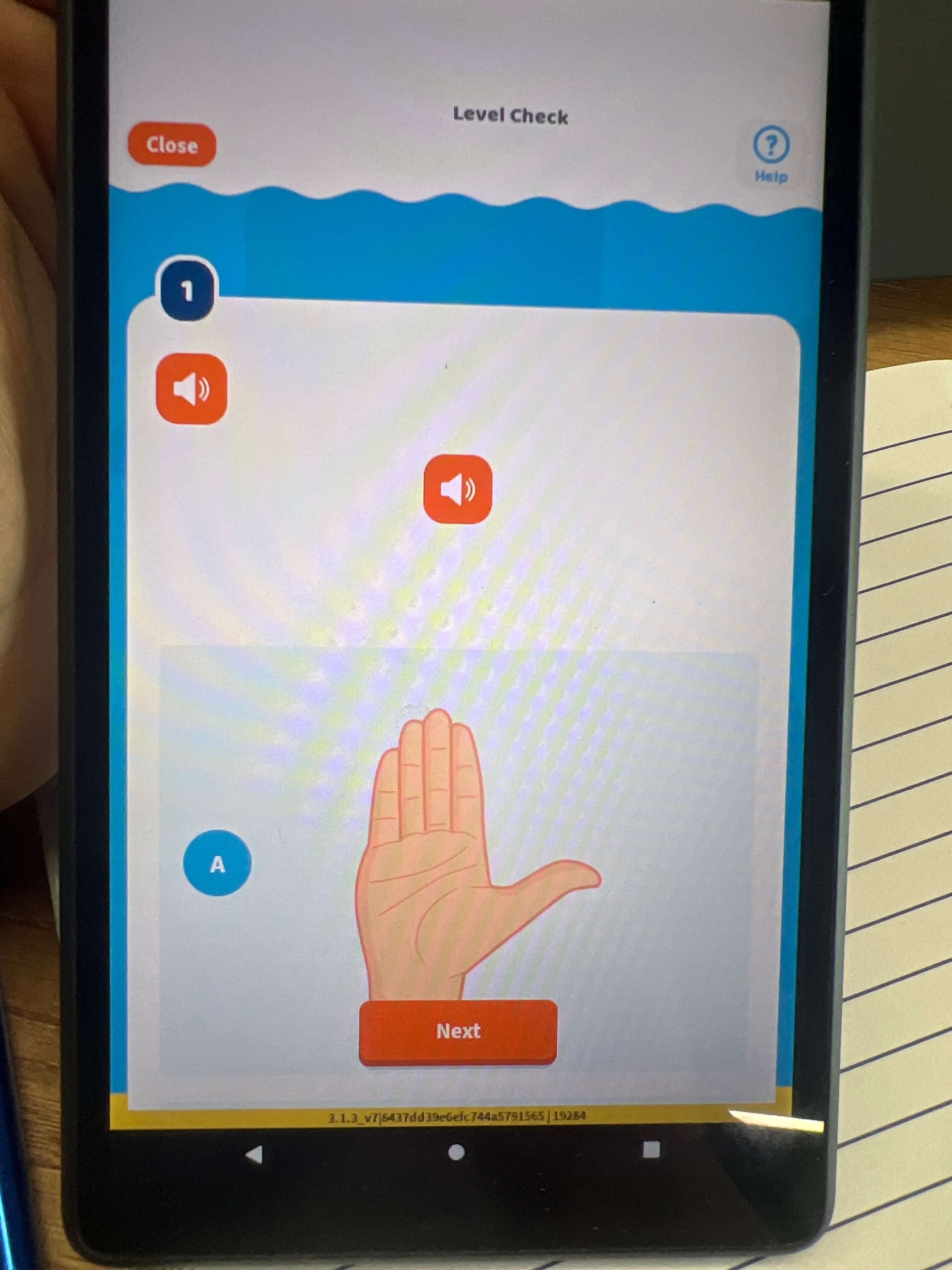
Question Type - Question not visible

image

Need to Improve

  • Interface design should be accessible to all users, including those with disabilities.
  • Providing text-based alternatives for audio-based content is important for accessibility.
  • The lack of text-based alternatives creates a significant barrier for users who are deaf or hard of hearing.
  • Displaying written questions on screen in a clear font is a recommended solution.
  • Providing text-based alternatives benefits all users, including those in noisy environments.
  • Providing text-based alternatives ensures all users can participate fully in the experience.
  1. Issues/bugs found - Text Size
  2. What works well -The interface is smooth.
  3. What can be improved -The text size can be increased to a minimum of 16px.

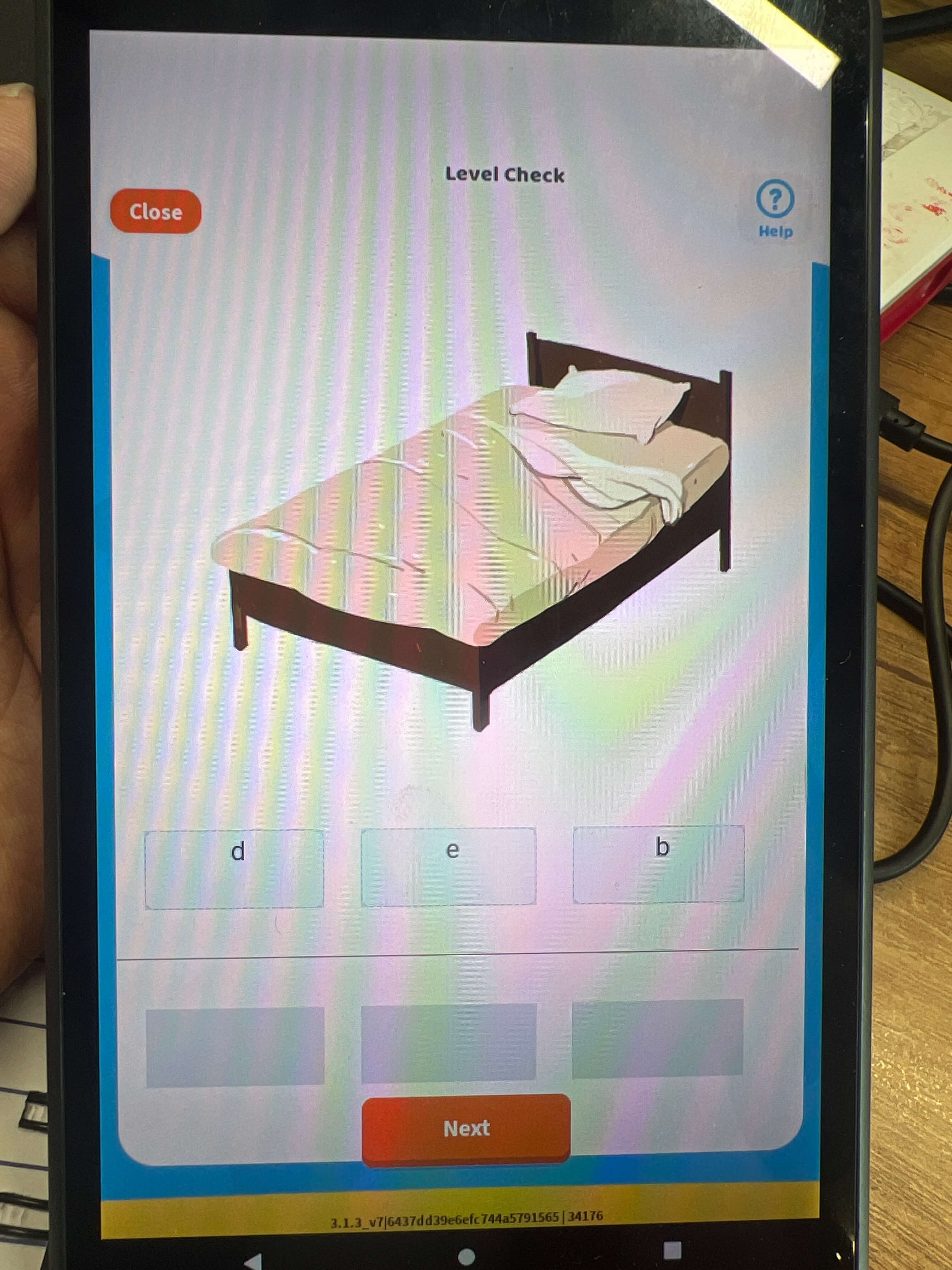
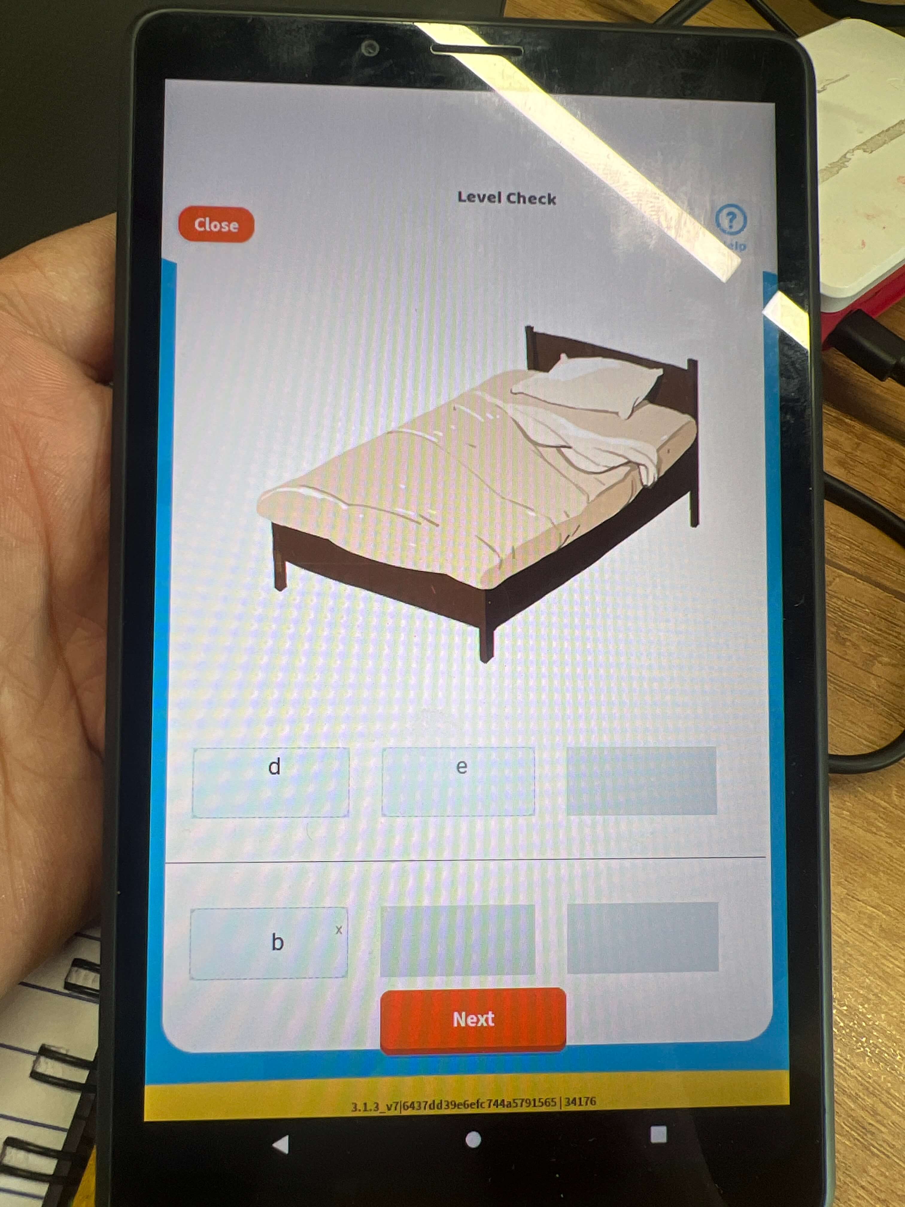
Question Type - Drag and Drop

image

Need to Improve

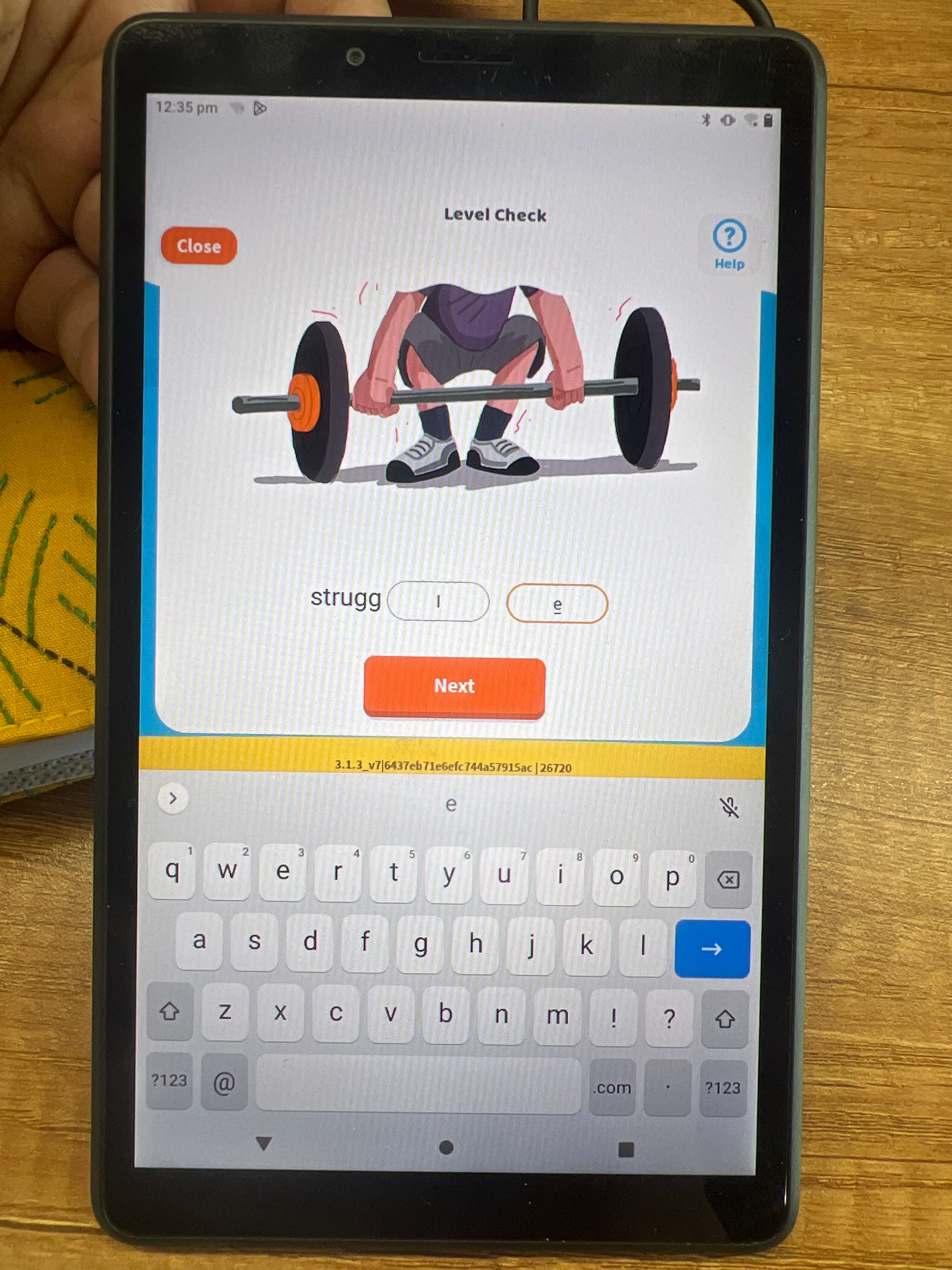
  • Proper letter alignment is important for readability within the input box.
  • Draggable functionality can make it easier to modify the text.
  • Draggable functionality is especially helpful for replacing letters in the middle of the text.
  • Incorporating draggable functionality can improve the user experience.
  1. Issues/bugs found -Drag and drop.
  2. What works well -The interface is smooth
  3. What can be improved -The text size can be increased to a minimum of 16px.

Question Type - Alignment Issue

image

Need to Improve

  • The close icon is important for exiting windows, dialog boxes, or messages.
  • The small close icon can make it difficult to locate and click on.
  • Increasing the size of the close icon to at least 24px can improve accessibility.
  • Proper alignment of the close icon within the interface is important.
  • Making these changes improves user-friendliness and accessibility, and overall user experience.
  1. Issues/bugs found -Close Icon.
  2. What works well -The interface is smooth.
  3. What can be improved -The icon size can be increased to a minimum of 16px and be properly aligned.

Subject Selection - Alignment

image

Need to Improve

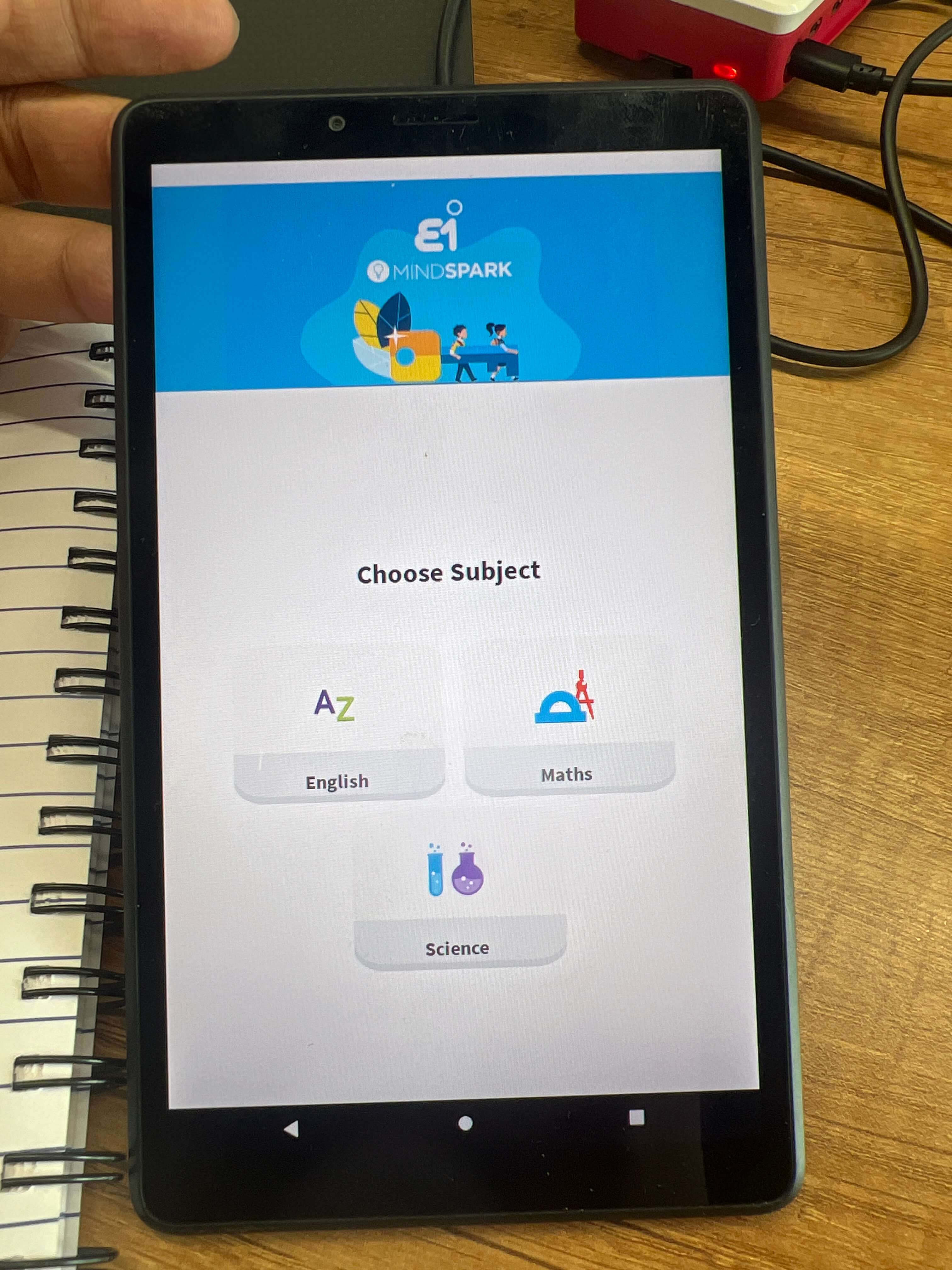
  • Subject names that are not vertically center-aligned can create a poor user experience.
  • This is because visual hierarchy and clarity are critical components of effective design, and misaligned subject names can make it harder for users to understand the content's structure and organization.
  • When subject names are not vertically center aligned, they can appear off-center or awkwardly placed.
  • This can cause confusion and make it harder for users to scan and navigate the content.
  • For example, in a list of items, if the subject names are not vertically center aligned, it can be harder to distinguish where one item ends and the next begins.
  • This can make the content less scannable and increase the cognitive load required to parse the information.
  1. Issues/bugs found -Curser Positioning.
  2. What works well -The Login page loades quickly.
  3. What can be improved -The curser bug needs to be resolved.

Question Type - Overlayed Keyboard on input field

image

Need to Improve

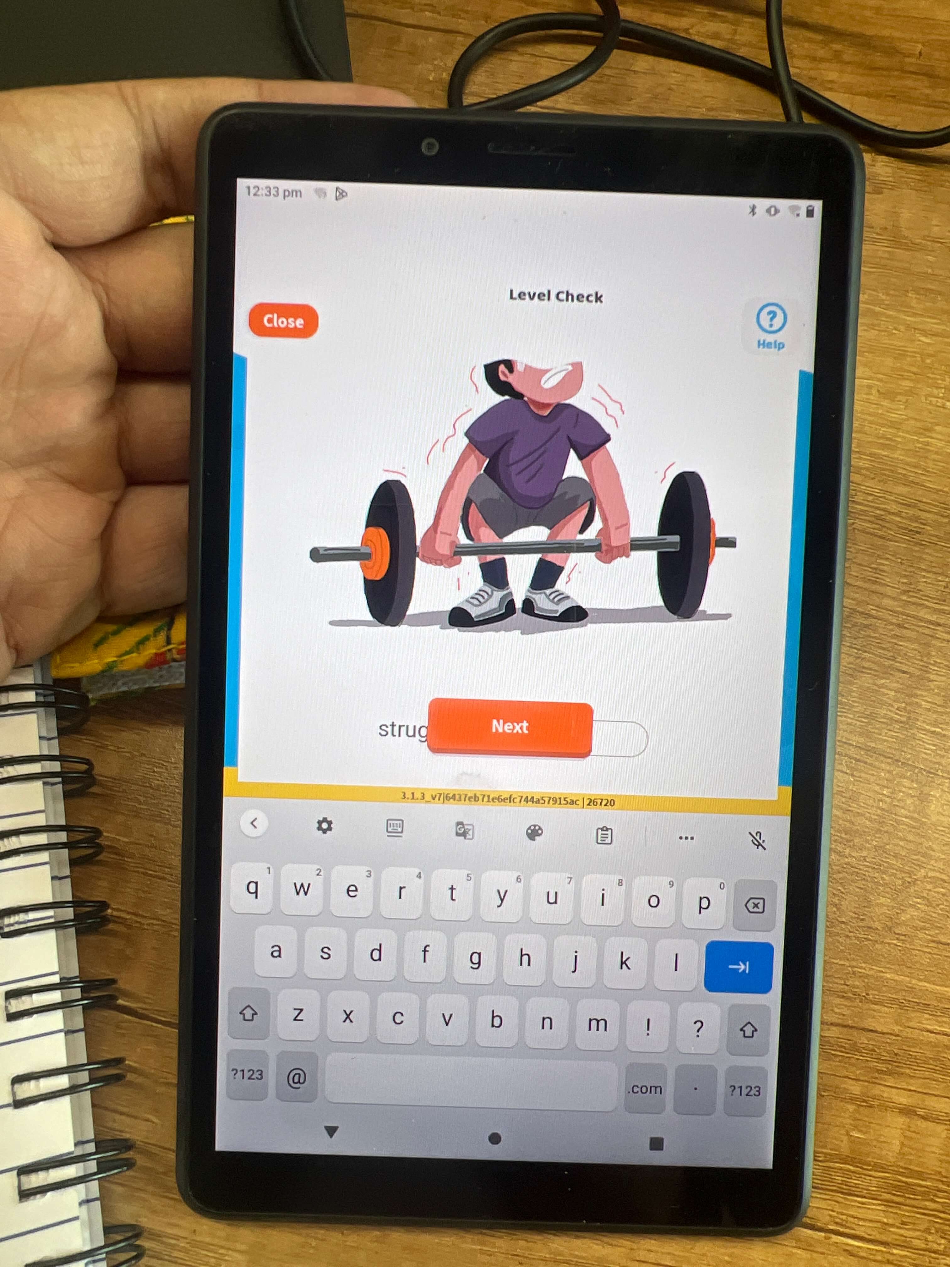
  • Implement an auto-scroll feature that moves the interface up when the user clicks on a text box to ensure the input box is visible
  • Position the keypad below the input box to avoid overlap with other elements.
  • Improvements will make the interface more user-friendly, efficient and reduce frustration/confusion.
  1. Issues/bugs found -Keypad overlapping.
  2. What works well - Even with the image present we can touch and scroll without any difficulty.
  3. What can be improved -We can add an auto-scroll effect if any input field is at the bottom it can just come above the keypad..

Header Spacing

image

Need to Improve

  • To optimize the use of space, consider analyzing the content and prioritizing the most important information.
  • An unclear hierarchy of information, inconsistent spacing between elements, or inefficient use of design elements may contribute to excess space in the header area.
  • Reconsider the placement of certain design elements.
  • Address alignment issues with headings to improve the design's professionalism and polish.
  1. Issues/bugs found -Spacing of Header.
  2. What works well -The interface works smoothly.
  3. What can be improved -The spacing on the header can be corrected and need to rethink the positioning of elements.

Overlayed Button - input field

image

Need to Improve

  • All design elements should be visible and accessible to users.
  • An issue exists where a button overlaps with an input field when the field is clicked on.
  • The overlapping design elements can make it difficult for users to interact with the interface.
  • Implementing an auto-scroll feature can be a potential solution to ensure that all design elements are visible when the input field is clicked on.
  • Reducing the header space can help to free up space on the interface and reduce the likelihood of design elements overlapping with one another.
  • Repositioning certain design elements or adjusting their size or spacing may be necessary.
  • Modifying the code or programming of the interface may be necessary to ensure that it responds correctly to user interactions.
  • Addressing these issues can create a more intuitive and user-friendly interface.
  1. Issues/bugs found -Overlaping of the input field.
  2. What works well -The interface works smoothly.
  3. What can be improved -To have an auto scroll option so that when clicking on the input field it slides up.

Question Type - Input field size and word limit

image

Need to Improve

  • Consider the amount of text expected to be entered and limit input size if necessary when designing an input field.
  • The input field in this case is too big and overwhelming for users.
  • Make the input field smaller and limit the amount of text that can be entered to match the size of a single letter.
  • Set a maximum character limit for the input box to prevent users from entering more than one character.
  • By doing this, the interface can be made more user-friendly and ensure that users can enter information without any confusion or difficulty.
  1. Issues/bugs found -Input field.
  2. What works well -The page is smooth.
  3. What can be improved -The input word limit should be set and the input field size should be reduced.

Question Completion Screen

image

Need to Improve

  • Placement and highlighting of the "Logout" button affects user experience and usability.
  • Highlighting may encourage premature or frequent exits from the interface.
  • Consider making the button less prominent or placing it in a less conspicuous location.
  • Providing clear instructions or prompts can guide users and encourage engagement with the content.
  • Improving overall usability and user experience can increase engagement and utilization of tools and resources.
  1. Issues/bugs found -Not a bug but UX wise a bad decision to highlight “Logout”.
  2. What works well -The page is smooth.
  3. What can be improved -The highlight option should be changed to “Home: to increase the interactivity of the user on the interface.

Roadmap of Students Levels

image

Need to Improve

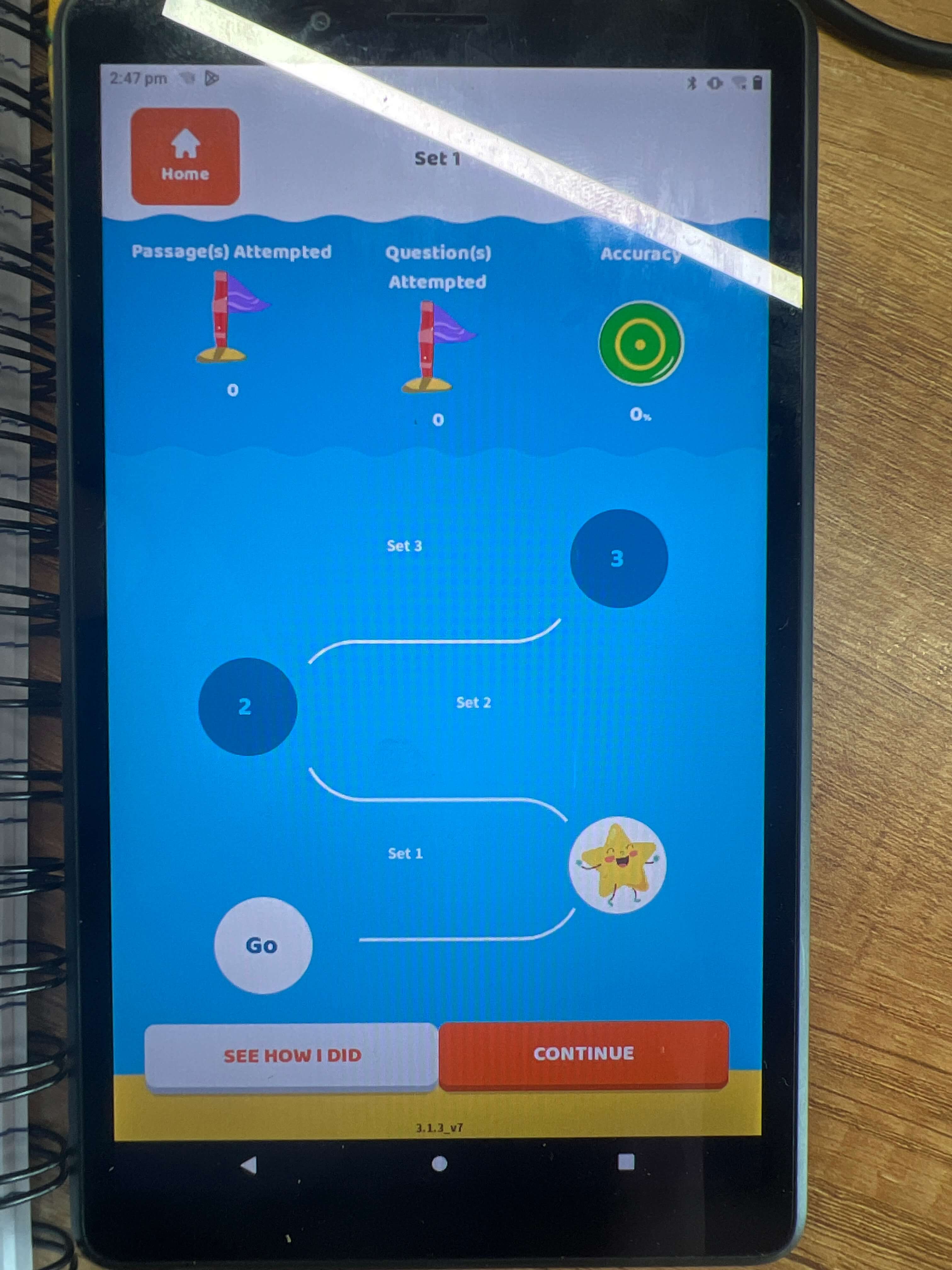
  • Buttons' spacing and size affect the user experience
  • Large and close-together buttons look congested and disorganized.
  • Increasing the margin between buttons can create visual separation and improve the identification of options.
  • Decreasing button size can prevent them from appearing overwhelming.
  • Balancing size and spacing is crucial to improving the usability and appearance of the interface.
  1. Issues/bugs found -Size on buttons and spacing between them..
  2. What works well -The page looks good.
  3. What can be improved - The button size can be decreased and need to have some margin space between the two..

Question Type - Header Spacing

image

Need to Improve

  • Displaying questions or set numbers in the dropdown menu is not necessary.
  • Suggest displaying the question or set number in a smaller font next to the question or in the top right corner
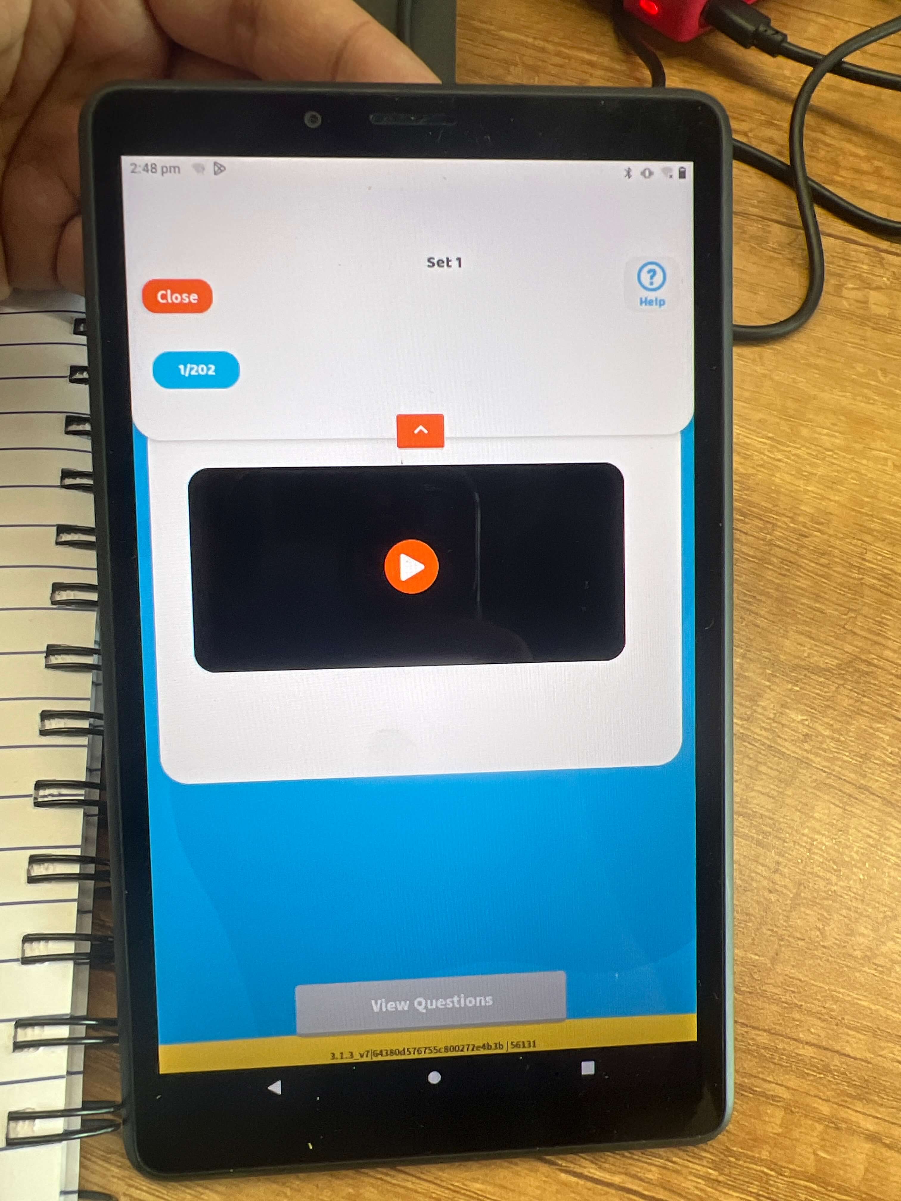
  • Unused space in the top header can be used more effectively.
  • Elements in the header such as the logo and navigation menu can be realigned for better balance and layout.
  • Consider reducing header space for increased screen real estate and less clutter.
  • Optimizing header layouts and design can improve the usability and user experience of the product.
  1. Issues/bugs found -The header space is a lot.
  2. What works well - The page looks good.
  3. What can be improved -The dropdown menu needs to revamp.

Category Selection - The selection goes completely dark

image

Need to Improve

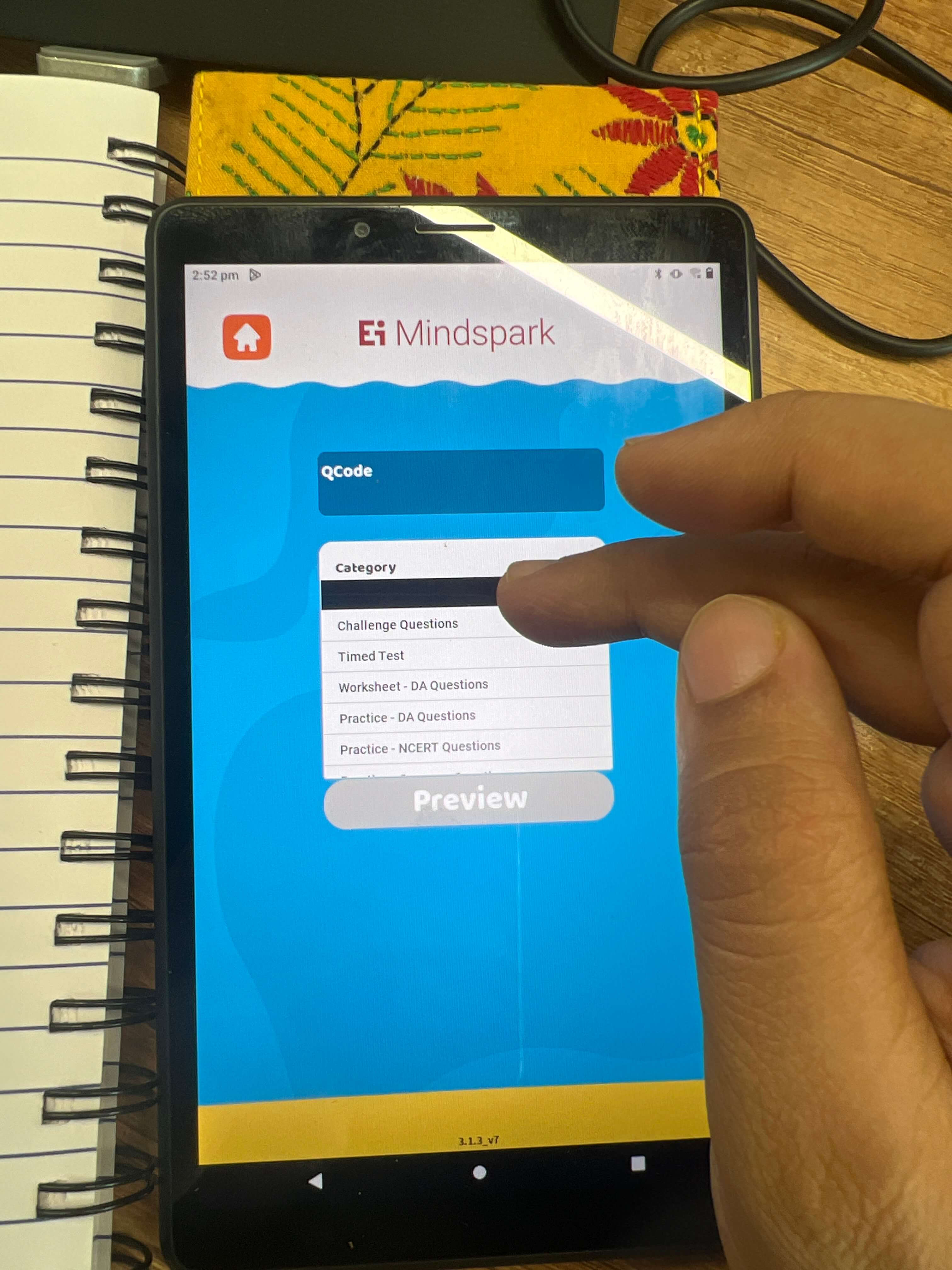
  • The "Category Section" dropdown menu goes completely black when an option is selected, making it difficult for users to determine which option is selected.
  • To make it clearer, a low-opacity or light color should be used when an option is selected to make it easily visible and readable.
  • The spacing between the category dropdown and the "Preview Button" is too small and inconsistent with the rest of the buttons on the interface.
  • The crowded and cramped look of the interface can be overwhelming and difficult to use for some users, so we need to revise the spacing and layout of the elements.
  • Sufficient space should be given between the elements to make them easily accessible and visually appealing.
  • We can consider realigning the elements and optimizing the use of space to improve the overall user experience.
  1. Issues/bugs found -The hover effect while selecting and Dropdown spacing with the button.
  2. What works well -The page looks good.
  3. What can be improved -We need to get the light color in the dropdown and also to have spacing in the between dropdown and the Preview button.

Category Selection - Input field word limit and button size

image

Need to Improve

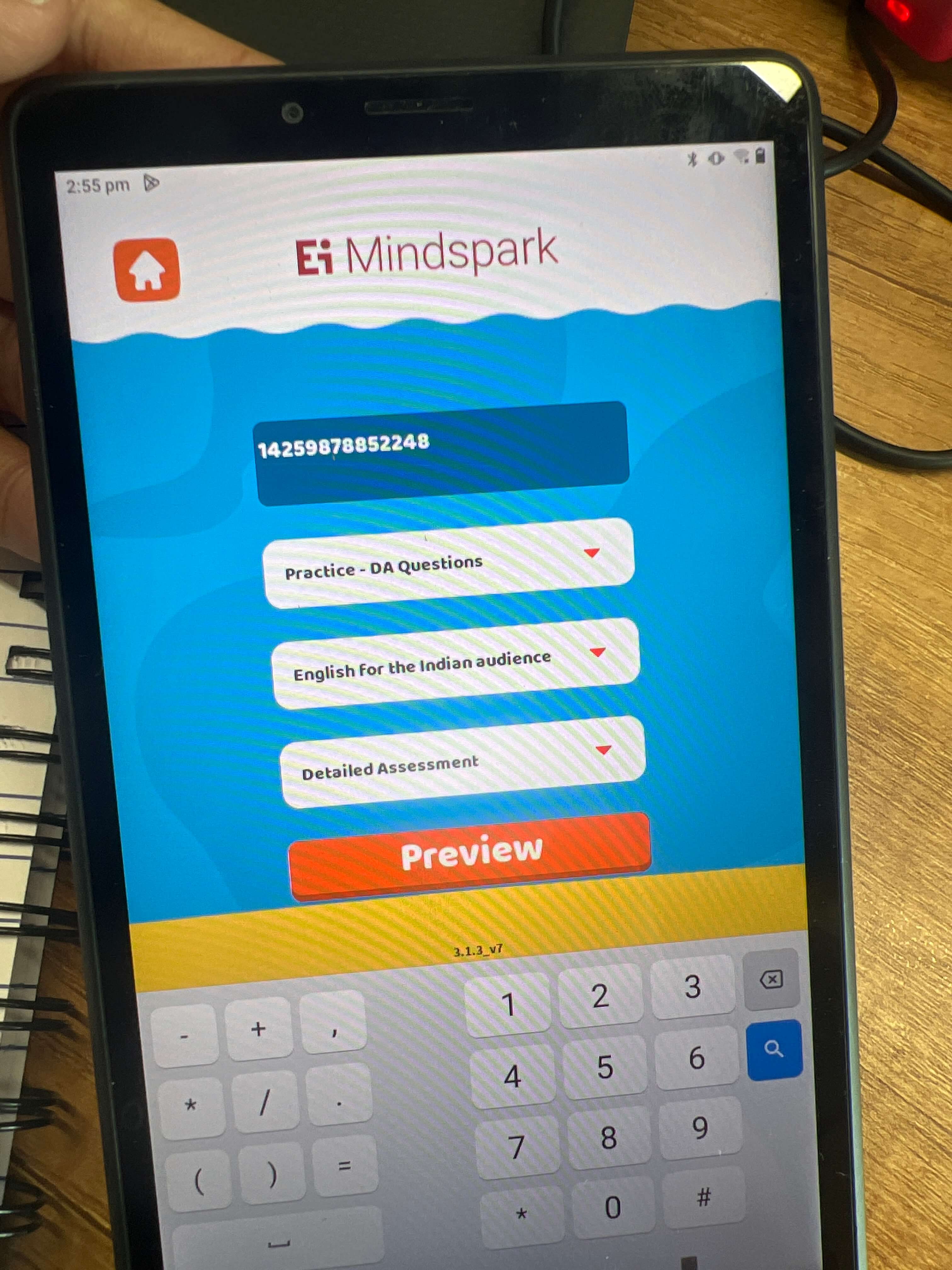
  • The button size is larger than necessary, and it takes up too much space in the layout.
  • The size of the button should be compressed to make it consistent with the design and save space.
  • The spacing between the text input box and the button is off, and it should be evenly distributed to look more aligned.
  • Adjusting the spacing can help make the interface look more polished and professional.
  • The text box doesn't denote exactly what is to be written, and it doesn't have any word limit which can also be an issue.
  • The use of the keypad is impressive, as it allows users to enter the input quickly and easily with both hands.
  • The keypad is reachable with the fingers, making it user-friendly.
  • Representing the keypad in the interface enhances the usability and accessibility of the interface.
  1. Issues/bugs found -Spacing in the input field and having a word count also if any wrong QCode is entered it should show an error.
  2. What works well -The keyboard design is amazing and very handy.
  3. What can be improved -To have a word limit and also to give an error if wrong code is written.

Unwanted blank Page

image

Need to Improve

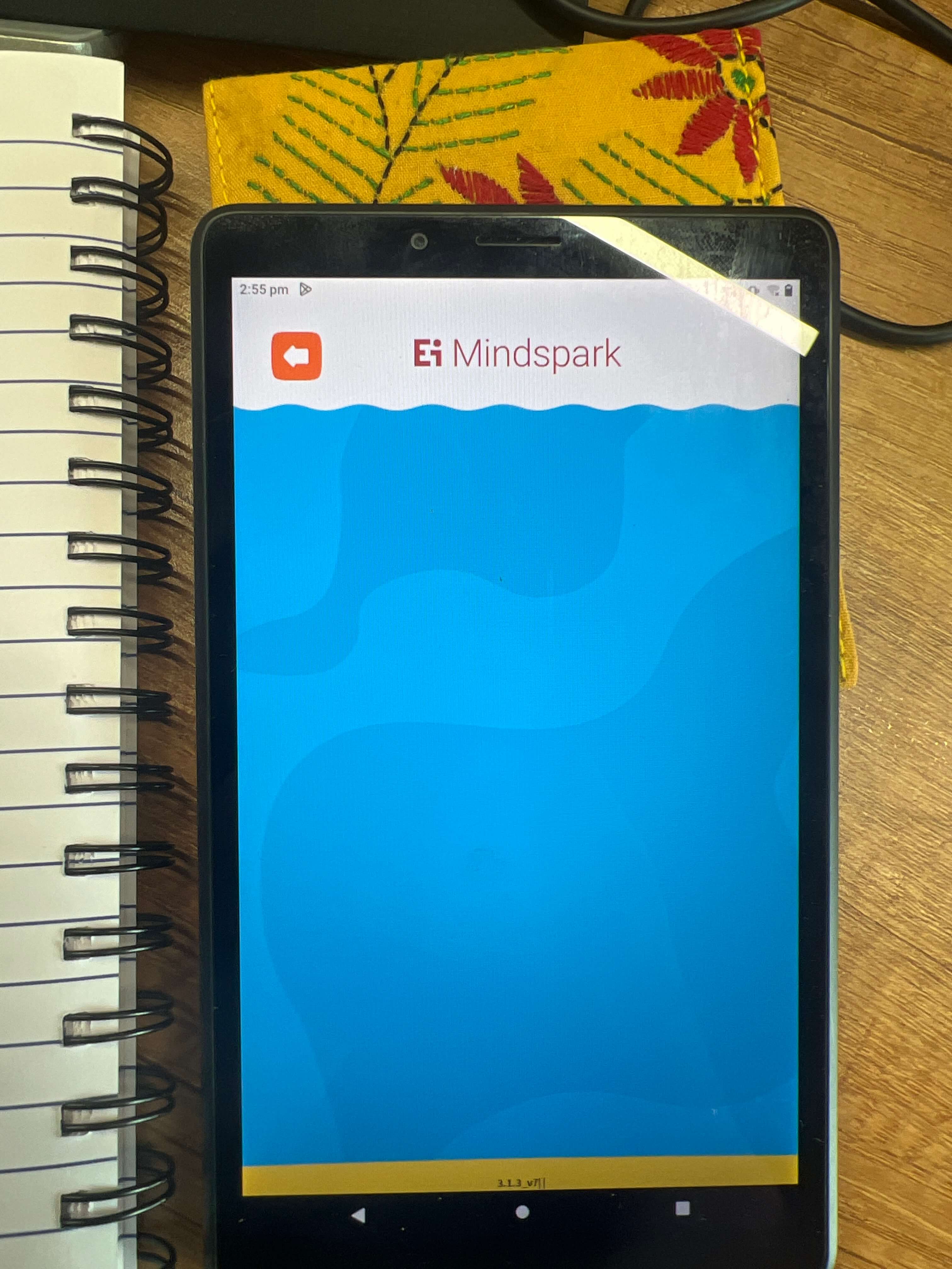
  • Upon reaching the results page, the user is faced with a blank page, which can be frustrating for the user.
  • Consider adding some form of message or visual indication to inform the user that the system is working on generating the results.
  • Add a loading spinner or progress bar to the interface to let the user know that something is happening.
  • If the results take longer than expected to generate, consider adding a message to inform the user of the delay.
  • Providing feedback after completing an action is essential, especially if the action involves a significant amount of effort or time, to increase the user's confidence in the system and reduce frustration and confusion.
  1. Issues/bugs found -If the wrong Qcode is written it should show an error not to open a new page.
  2. What works well -
  3. What can be improved -New page should not open with the wrong code.

Heading

image

Need to Improve

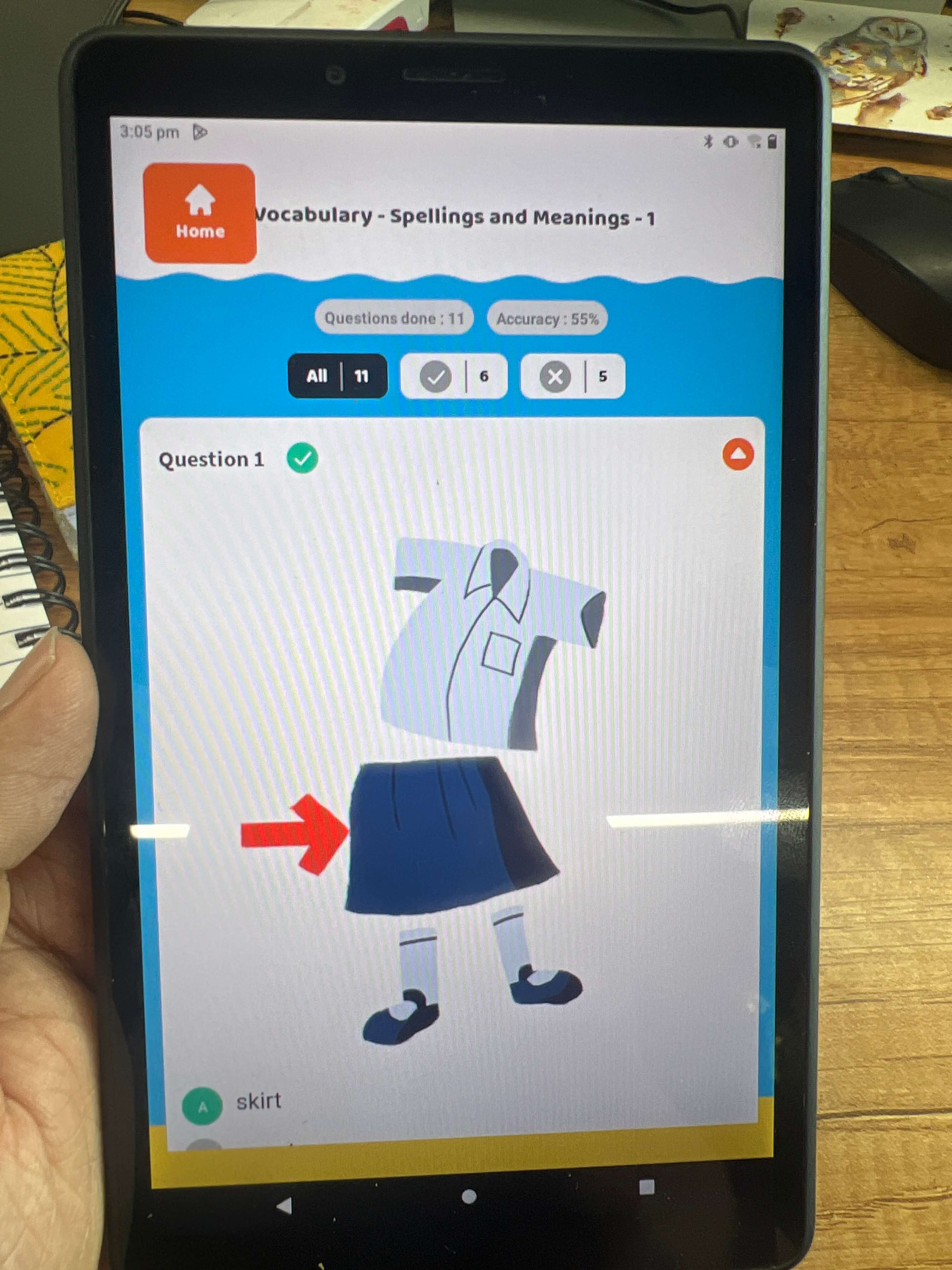
  • The heading and home options are overlapping in the interface.
  • This could be due to no word limit for the heading or layout constraints.
  • A new layout or limiting word count may be necessary.
  • Font size and spacing adjustments may also help.
  • Ensure all elements are clearly visible and easy to navigate.
  • Accuracy and question-done chips need a color change for better accessibility..
  1. Issues/bugs found -Curser Positioning.
  2. What works well -The Login page loades quickly.
  3. What can be improved -The curser bug needs to be resolved.

After completion of questions back to home page

image

Need to Improve

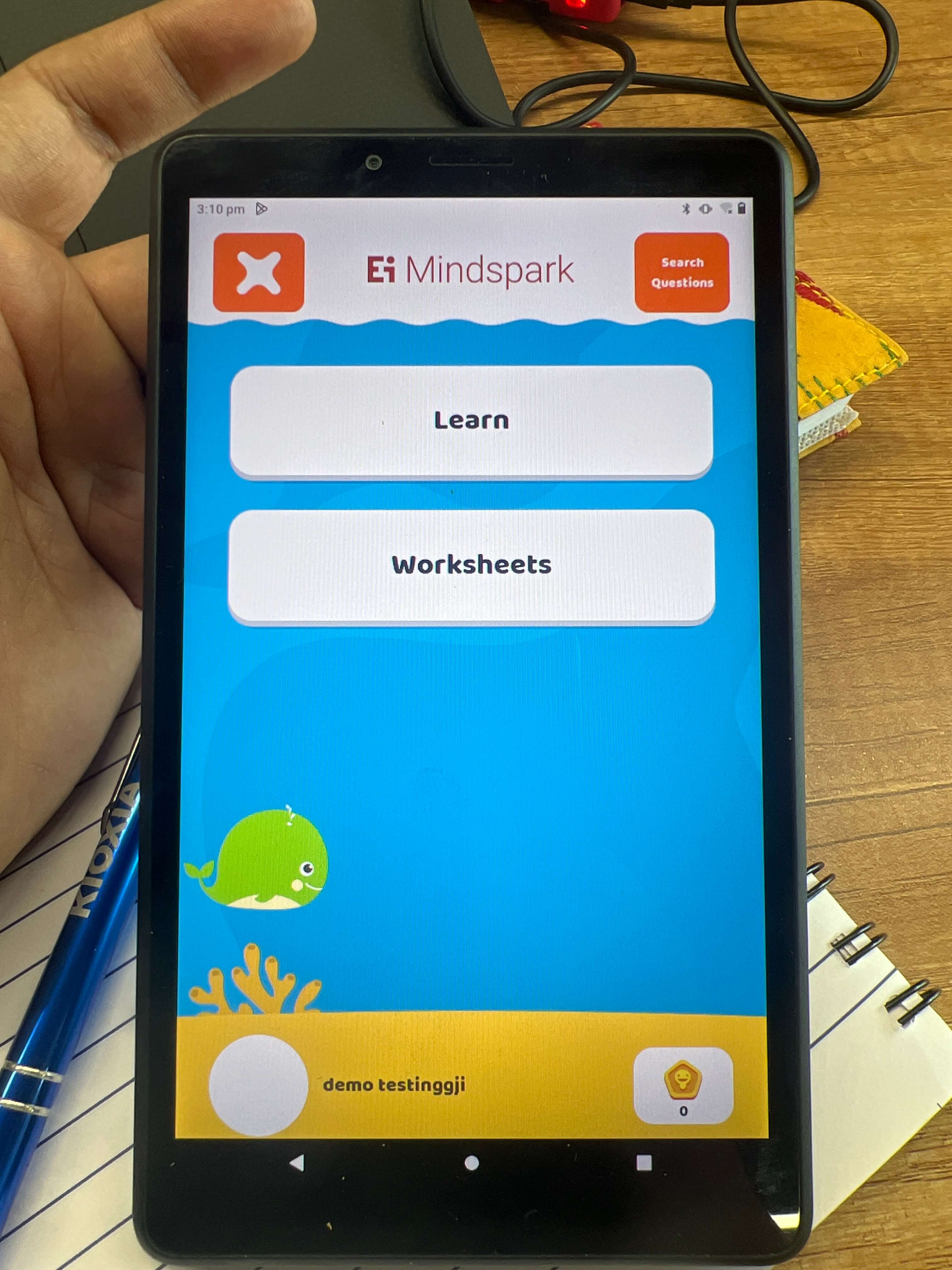
  • Add a default avatar image to the interface .
  • Add some bottom margin to make the interface look more balanced.
  • Adjust the layout and add padding or margin to the bottom.
  • A default avatar and bottom margin will improve the user experience by providing consistency and better interface design.
  1. Issues/bugs found -The avatar is not visible.
  2. What works well -The page looks good.
  3. What can be improved -To have some constant avatar if the profile picture is not present.